Blog

  • Dataweave – Smartphones vs Tablets: Does size matter?

    Dataweave – Smartphones vs Tablets: Does size matter?

    Smartphones vs Tablets: Does size matter?

    We have seen a steady increase in the number of smartphones and tablets since the last five years. Looking at the number of smartphones, tablets and now wearables ( smart watches and fitbits ) that are being launched in the mobiles market, we can truly call this ‘The Mobile Age’.

    We, at DataWeave, deal with millions of data points related to products which vary from electronics to apparel. One of the main challenges we encounter while dealing with this data is the amount of noise and variation present for the same products across different stores.

    One particular problem we have been facing recently is detecting whether a particular product is a mobile phone (smartphone) or a tablet. If it is mentioned explicitly somewhere in the product information or metadata, we can sit back and let our backend engines do the necessary work of classification and clustering. Unfortunately, with the data we extract and aggregate from the Web, chances of finding this ontological information is quite slim.

    To address the above problem, we decided to take two approaches.

    • Try to extract this information from the product metadata
    • Try to get a list of smartphones and tablets from well known sites and use this information to augment the training of our backend engine

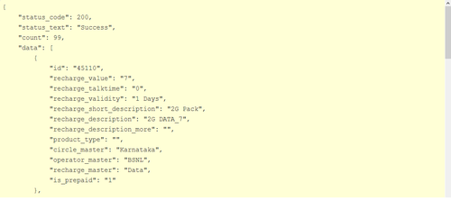
    Here we will talk mainly about the second approach since it is more challenging and engaging than the former. To start with, we needed some data specific to phone models, brands, sizes, dimensions, resolutions and everything else related to the device specifications. For this, we relied on a popular mobiles/tablets product information aggregation site. We crawled, extracted and aggregated this information and stored it as a JSON dump. Each device is represented as a JSON document like the sample shown below.

    { "Body": { "Dimensions": "200 x 114 x 8.7 mm", "Weight": "290 g (Wi-Fi), 299 g (LTE)" }, "Sound": { "3.5mm jack ": "Yes", "Alert types": "N/A", "Loudspeaker ": "Yes, with stereo speakers" }, "Tests": { "Audio quality": "Noise -92.2dB / Crosstalk -92.3dB" }, "Features": { "Java": "No", "OS": "Android OS, v4.3 (Jelly Bean), upgradable to v4.4.2 (KitKat)", "Chipset": "Qualcomm Snapdragon S4Pro", "Colors": "Black", "Radio": "No", "GPU": "Adreno 320", "Messaging": "Email, Push Email, IM, RSS", "Sensors": "Accelerometer, gyro, proximity, compass", "Browser": "HTML5", "Features_extra detail": "- Wireless charging- Google Wallet- SNS integration- MP4/H.264 player- MP3/WAV/eAAC+/WMA player- Organizer- Image/video editor- Document viewer- Google Search, Maps, Gmail,YouTube, Calendar, Google Talk, Picasa- Voice memo- Predictive text input (Swype)", "CPU": "Quad-core 1.5 GHz Krait", "GPS": "Yes, with A-GPS support" }, "title": "Google Nexus 7 (2013)", "brand": "Asus", "General": { "Status": "Available. Released 2013, July", "2G Network": "GSM 850 / 900 / 1800 / 1900 - all versions", "3G Network": "HSDPA 850 / 900 / 1700 / 1900 / 2100 ", "4G Network": "LTE 800 / 850 / 1700 / 1800 / 1900 / 2100 / 2600 ", "Announced": "2013, July", "General_extra detail": "LTE 700 / 750 / 850 / 1700 / 1800 / 1900 / 2100", "SIM": "Micro-SIM" }, "Battery": { "Talk time": "Up to 9 h (multimedia)", "Battery_extra detail": "Non-removable Li-Ion 3950 mAh battery" }, "Camera": { "Video": "Yes, 1080p@30fps", "Primary": "5 MP, 2592 x 1944 pixels, autofocus", "Features": "Geo-tagging, touch focus, face detection", "Secondary": "Yes, 1.2 MP" }, "Memory": { "Internal": "16/32 GB, 2 GB RAM", "Card slot": "No" }, "Data": { "GPRS": "Yes", "NFC": "Yes", "USB": "Yes, microUSB (SlimPort) v2.0", "Bluetooth": "Yes, v4.0 with A2DP, LE", "EDGE": "Yes", "WLAN": "Wi-Fi 802.11 a/b/g/n, dual-band", "Speed": "HSPA+, LTE" }, "Display": { "Multitouch": "Yes, up to 10 fingers", "Protection": "Corning Gorilla Glass", "Type": "LED-backlit IPS LCD capacitive touchscreen, 16M colors", "Size": "1200 x 1920 pixels, 7.0 inches (~323 ppi pixel density)" } }

    From the above document, it is clear that there are a lot of attributes that can be assigned to a mobile device. However, we would not need all of them for building our simple algorithm for labeling smartphones and tablets. I had decided to use the device screen size for separating out smartphones vs tablets, but I decided to take some suggestions from our team. After sitting down and taking a long, hard look at our dataset, Mandar had an idea of using the device dimensions also for achieving the same goal!

    Finally, the attributes that we decided to use were,

    • Size
    • Title
    • Brand
    • Device dimensions

    Screen sizeI wrote some regular expressions for extracting out the features related to the device screen size and resolution. Getting the resolution was easy, which was achieved with the following Python code snippet. There were a couple of NA values but we didn’t go out of our way to get the data by searching on the web because resolution varies a lot and is not a key attribute for determining if a device is a phone or a tablet.

    size_str = repr(doc["Display"]["Size"]) resolution_pattern = re.compile(r'(?:\S+\s)x\s(?:\S+\s)\s?pixels') if resolution_pattern.findall(size_str): resolution = ''.join([token.replace("'","") for token in resolution_pattern.findall(size_str)[0].split()[0:3]]) else: resolution = 'NA'

    But the real problems started when I wrote regular expressions for extracting the screen size. I started off with analyzing the dataset and it seemed that screen size was mentioned in inches so I wrote the following regular expression for getting screen size.

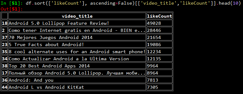
    size_str = repr(doc[“Display”][“Size”]) screen_size_pattern = re.compile(r'(?:\S+\s)\s?inches’) if screen_size_pattern.findall(size_str): screen_size = screen_size_pattern.findall(size_str)[0].split()[0] else: screen_size = ‘NA’

    However, I noticed that I was getting a lot of ‘NA’ values for many devices. On looking up the same devices online, I noticed there were three distinct patterns with regards to screen size. They are,

    • Screen size in ‘inches’
    • Screen size in ‘lines’
    • Screen size in ‘chars’ or ‘characters’

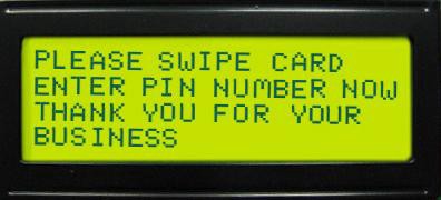
    Now, some of you might be wondering what on earth do ‘lines’ and ‘chars’ mean and how do they measure screen size. On digging it up, I found that basically both of them mean the same thing but in different formats. If we have ‘n lines’ as the screen size, it means, the screen can display at most ‘n’ lines of text at any instance of time. Likewise, if we have ‘n x m chars’ as the screen size, it means the device can diaplay ‘n’ lines of text at any instance of time with each line having a maximum of ‘m’ characters. The picture below will make things more clear. It represents a screen of 4 lines or 4 x 20 chars.

    Thus, the earlier logic for extracting screen size had to be modified and we used the following code snippet. We had to take care of multiple cases in our regexes, because the data did not have a consistent format.

    Thus, the earlier logic for extracting screen size had to be modified and we used the following code snippet. We had to take care of multiple cases in our regexes, because the data did not have a consistent format.

    size_str = repr(doc["Display"]["Size"]) screen_size_pattern = re.compile(r'(?:\S+\s)\s?inc[h|hes]') if screen_size_pattern.findall(size_str): screen_size = screen_size_pattern.findall(size_str)[0] .replace("'","").split()[0]+' inches' else: screen_size_pattern = re.compile(r'(?:\S+\s)\s?lines') if screen_size_pattern.findall(size_str): screen_size = screen_size_pattern.findall(size_str)[0] .replace("'","").split()[0]+' lines' else: screen_size_pattern = re.compile(r'(?:\S+\s)x\s(?:\S+\s)\s?char[s|acters]') if screen_size_pattern.findall(size_str): screen_size = screen_size_pattern.findall(size_str)[0] .replace("'","").split()[0]+' lines' else: screen_size = 'NA'

    Mandar helped me out with extracting the ‘dimensions’ attribute from the dataset and performing some transformations on it to get the total volume of the phone. It was achieved using the following code snippet.

    dimensions = doc['Body']['Dimensions'] dimensions = re.sub (r'[^\s*\w*.-]', '', dimensions.split ('(') [0].split (',') [0].split ('mm') [0]).strip ('-').strip ('x') if not dimensions: dimensions = 'NA' total_area = 'NA' else: if 'cc' in dimensions: total_area = dimensions.split ('cc') [0] else: total_area = reduce (operator.mul, [float (float (elem.split ('-') [0])/10) for elem in dimensions.split ('x')], 1) total_area = round(float(total_area),3)

    We used PrettyTable to output the results in a clear and concise format.

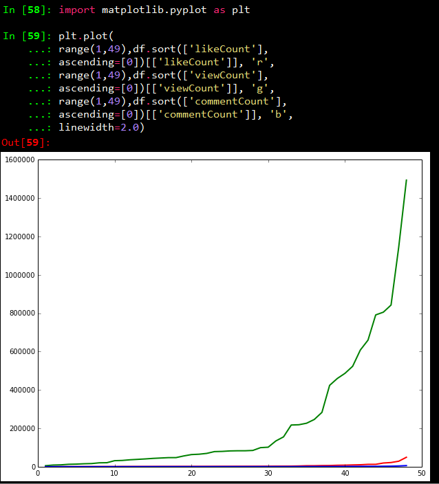
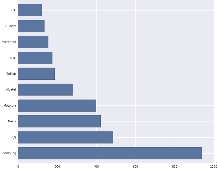
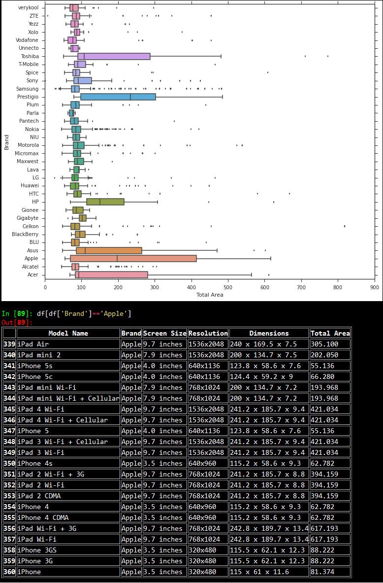
    Next, we stored the above data in a csv file and used PandasMatplotlib, Seaborn and IPython to do some quick exploratory data analysis and visualizations. The following depicts the top ten brands with the most number of mobile devices as per the dataset.

    Then, we looked at the device area frequency for each brand using boxplots as depicted below. Based on the plot, it is quite evident that almost all the plots are right skewed, with a majority of the distribution of device dimensions (total area) falling in the range [0,150]. There are some notable exceptions like ‘Apple’ where the skew is considerably less than the general trend. On slicing the data for the brand ‘Apple’, we noticed that this was because devices from ‘Apple’ have an almost equal distribution based on the number of smartphones and tablets, leading to the distribution being almost normal.

    Based on similar experiments, we noticed that tablets had larger dimensions as compared to mobile phones, and screen sizes followed that same trend. We made some quick plots with respect to the device areas as shown below.

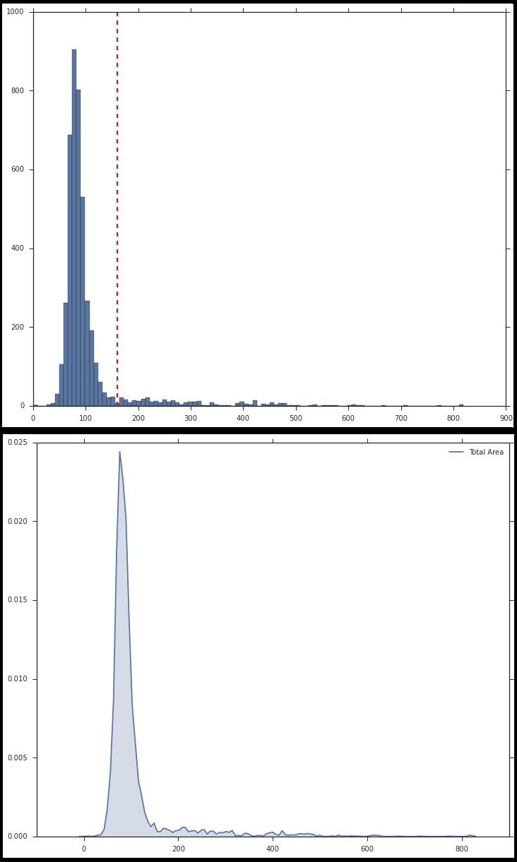
    Now, take a look at the above plots again. The second plot shows the distribution of device areas in a kernel density plot. This distribution resembles a Gaussian distribution but with a right skew. [Mandar reckons that it actually resembles a Logistic distribution, but who’s splitting hairs, eh? ;)] The histogram plot depicts the same, except here we see the frequency of devices vs the device areas. Looking at it closely, Mandar said that the bell shaped curve had the maximum number of devices and those must be all the smartphones, while the long thin tail on the right side must indicate tablets. So we set a cutoff of 160 cubic centimeters for distinguishing between phones and tablets.

    We also decided to calculate the correlation between ‘Total Area’ and ‘Screen Size’ because as one might guess, devices with larger area have large screen sizes. So we transformed the screen sizes from textual to numeric format based on some processing, and calculated the correlation between them which came to be around 0.73 or 73%

    We did get a high correlation between Screen Size and Device Area. However, I still wanted to investigate why we didn’t get a score close to 90%. On doing some data digging, I noticed an interesting pattern.

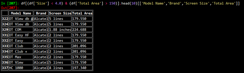
    After looking at the above results, what came to our minds immediately was: why do phones with such small screen sizes have such big dimensions? We soon realized that these devices were either “feature phones” of yore or smartphones with a physical keypad!

    Thus, we used screen sizes in conjunction with dimensions for labeling our devices. After a long discussion, we decided to use the following logic for labeling smartphones and tablets.

    device_class = None if total_area >= 160.0: device_class = 'Tablet' elif total_area < 160.0: device_class = 'Phone' if 'lines' in screen_size: device_class = 'Phone' elif 'inches' in screen_size: if float(screen_size.split()[0]) < 6.0: device_class = 'Phone'

    After all this fun and frolic with data analysis, we were able to label handheld devices correctly, just like we wanted it!

    Originally published at blog.priceweave.com.

  • Why is Product Matching Difficult? | DataWeave

    Why is Product Matching Difficult? | DataWeave

    Product Matching is a combination of algorithmic and manual techniques to recognize and match identical products from different sources. Product matching is at the core of competitive intelligence for retail. A competitive intelligence product is most useful when it can accurately match products of a wide range of categories in a timely manner, and at scale.

    Shown below is PriceWeave’s Products Tracking Interface, one of the features where product matching is in action. The Products Tracking Interface lets a brand or a retailer track their products and monitor prices, availability offers, discounts, variants, and SLAs on a daily (or a more frequent) basis.


    A snapshot of products tracked for a large online mass merchant


    Expanded view for a product shows the prices related data points from competing stores

    Product Matching helps a retailer or a brand in several ways:

    • Tracking competitor prices and stock availability
    • Organizing seller listings on a marketplace platform
    • Discovering gaps in product catalog
    • Filling the missing attributes in product catalog information
    • Comparing product life cycles across competitors

    Given its criticality, every competitive intelligence product strives hard to make its product matching accurate and comprehensive. It is a hard problem, and one that cannot be complete addressed in an automated fashion. In the rest of this post, we will talk about why product matching is hard.

    Product Matching Guidelines

    Amazon provides a guideline to sellers about how they should write product catalog information in order to achieve a good product matching with respect to their seller listings. These guidelines apply to any retail store or marketplace platform. The trouble is, more often than not these guidelines are not followed, or cannot by retailers because they don’t have access to all the product related information. Some of the challenges are:

    • Products either don’t have a UPC code or it is not available. There are also non-standard products, unbranded products, and private label products.
    • There are products with slights variations in technical specifications, but the complete specs are not available.
    • Retailers manage a huge catalog of accessories, for instance Electronics Accessories (screen guards, flip covers, fancy USB drives, etc.).
    • Apparels and Lifestyle products often have very little by way of unique identifiers. There is no standard nomenclature for colors, material and style.
    • Products are often bundled with accessories or other related products. There are no standard ways of doing product bundling.

    In the absence of standard ways of representing products, every retailer uses their own internal product IDs, product descriptions, and attribute names.

    Algorithmic Product Matching using “Document Clustering”

    Algorithmic product matching is done using some Machine Learning, typically techniques from Document Clustering. A document is a text document or a web page, or a set of terms that usually occur within a “context”. Document clustering is the process of bringing together (forming clusters of) similar documents, and separating our dissimilar ones. There are many ways of defining similarity of documents that we will not delve into in this post. Documents have “features” that act as “identifiers” that help an algorithm cluster them.

    A document in our case is a product description — essentially a set of data points or attributes we have extracted from a product page. These attributes include: title, brand, category, price, and other specs. Therefore, these are the attributes that help us cluster together similar products and match products. The quality of clustering — that is how accurate and how complete the clusters are — depends on how good the features are. In our case, most of the times the features are not good, and that is what makes clustering, and in turn product matching, a hard problem.

    Noisy Small Factually Weak (NSFW) Documents

    The documents that we deal with, the product descriptions, are not well formed and so not readily usable for product matching. We at PriceWeave characterize them endearignly as Noisy Weak and Factually Weak (NSFW) documents. Let us see some examples to understand these terms.

    Noisy

    • Spelling errors, non-standard and/or incomplete representations of product features.
    • Brands written as “UCB” and “WD” instead of “United Colors of Benetton” and “Western Digital”.
    • Model no.s might or might not be present. A camera’s model number written as one of the following variants: DSC-WX650 vs DSCWX650 vs DSC WX 650 vs WX 650.
    • Noisy/meaningless terms might be present (“brand new”, “manufacturer’s warranty”, “with purchase receipt”)

    Small

    • Not much description. A product simply written as “Apple iPhone” without any mention of its generation, or other features.
    • Not many distinguishable features. Example, “Samsung Galaxy Note vs Samsung Galaxy Note 2”, “Apple ipad 3 16 GB wifi+cellular vs Apple ipad mini 16 GB wifi-cellular”

    Factually Weak

    • Products represented with generic and subjective descriptions.
    • Colours and their combinations might be represented differently. Examples, “Puma Red Striped Bag”, “Adidas Black/Red/Blue Polo Tshirt”.

    In the absence of clean, sufficient, and specific product information, the quality of algorithmic matching suffers. Product matching include many knobs and switches to adjust the weights given to different product attributes. For example, we might include a rule that says, “if two products are identical, then they fall in the same price range.” While such rules work well generally, they vary widely from category to category and across geographies. Further, adding more and more specific rules will start throwing off the algorithms in unexpected ways rendering them less effective.

    In this post, we discussed the challenges posed by product matching that make it a hard problem to crack. In the next post, we will discuss how we address these challenges to make PriceWeave’s product matching robust.

    PriceWeave is an all-around Competitive Intelligence product for retailers, brands, and manufacturers. We’re built on top of huge amounts of products data to provide real-time actionable insights. PriceWeave’s offerings include: pricing intelligence, assortment intelligence, gaps in catalogs, and promotion analysis. Please visit PriceWeave to view all our offerings. If you’d like to try us out request for a demo.

    Originally published at blog.priceweave.com.

  • How Colors Influence Consumer Buying Patterns | DataWeave

    How Colors Influence Consumer Buying Patterns | DataWeave

    Research shows that the colour of the clothes we wear significantly affect our day to day lives. For instance wearing black might help us appear powerful and authoritative at the workplace, while a red dress can make us look more attractive to a date. A yellow top might brighten up one’s day and a blue one land us a nifty bonus.

    Oftentimes buyers navigating the myriad nuances of current fashion look for help from friends, popular media and retailers themselves. Retailers, for their part, try to stay ahead of fashion trends by meticulously studying trends from magazines, keeping a close eye on competitors and wading through the chatter on social media and fashion blogs.

    Now that most of retail is metrics driven and becoming smarter by the day, we asked ourselves whether there is a more optimal way to analyse the influence of colors on customer buying decisions. Here’s how we went about doing it:

    Method:

    Thanks to the internet, a huge mine of valuable fashion data is available to us through e-commerce sites, brand Pinterest pages and fashion blogs, which regularly update their content streams with the newest fashion offerings. Data ranging from featured fashion of the current season including the complete product catalogue of brands as well as combinations of dresses that go together (even between brands) are all available for us to collect and analyse.

    By crawling these sites, pages and blogs periodically we can extract the colors on each of the images shared. This data is very helpful for any online/offline merchant to visualize the current trend in the market and plan out their own product offering. It is also possible to plot monthly data to capture the timeline of trends across different fashion websites.

    How is it Useful?

    Let us assess the applications made possible from this data. How would color analysis assist product managers, category heads and merchandising heads?

    1.Spotting current trends:

    Color analysis can spot current trends across brands and various filters. This gives decision makers the ability to gauge and respond to current trends and offerings. Some filters that can be used to analyse this are price, colors, categories, subcategories etc

    2.Predictive trends:

    Using historical color data future trends can be spotted with greater accuracy. With this data decision makers can stay ahead of the demands and the predictions of the market and gain a foothold on the ever changing nature of fashion.

    3.Assortment Analysis:

    Assortment Analysis can become more in depth and insightful with color analysis. Assortment comparisons of one’s offerings v/s competitor’s offerings can give a clear cut decision pointers on both one’s color offerings present and categories one can focus on to get ahead of the competition.

    4.Recommendations

    A strong recommendation feature is vital in driving up sales by offering the right products to buyers at the right time. Analysis of colors helps recommendations become smarter and more relevant. For instance, the algorithm can help understand what tops go with which jeans or which shirts go with what ties.

    Colours add a new dimension to current business analytics. Decision makers will be able to access enhanced analytics on existing products and compare across sources based on parameters such as price, categories, subcategories etc.

    Color Analysis in retail is largely unexplored and rife with possibilities. Doing it at scale presents a number of unique challenges that we are addressing. We’re excited to bring novel techniques and the power of large scale data analytics to retail.

    Color analysis will add to a retailer’s understanding of consumer buying patterns. This will help retailers sell better and improve profit margins. We are currently working on integrating this feature into PriceWeave so that our customers can do a comparative assortment analysis with color as an additional dimension.

    About Priceweave:

    PriceWeave provides Competitive Intelligence for retailers, brands, and manufacturers. We’re built on top of huge amounts of products data to provide features such as: pricing opportunities (and changes), assortment intelligence, gaps in catalogs, reporting and analytics, and tracking promotions, and product launches. PriceWeave lets you track any number of products across any number of categories against your competitors. If you’d like to try us out request for a demo.

    Originally published at blog.priceweave.com.


  • Tips on How to Price Your Products | DataWeave

    Tips on How to Price Your Products | DataWeave

    Picture this. You’re approaching the biggest sale of the year for your business, the number of offerings are ever growing and your competitors are inching in on your turf. How then are you to tackle the complex & challenging task of pricing your offerings? In short how do you know if the price is right?

    Here’s how we think it’s possible:

    1. Prioritize your objectives

    Pricing can be modified based on your priorities. A good pricing intelligence tool lets you understand pricing opportunities across different dimensions (categories/brands, etc.). Which categories do you want to score on? Which price battles do you choose to fight? Once you have decided your focus areas, you can make pricing decisions accordingly.

    2. Trading off margins for market share (or vice versa)

    Trading off profits for larger market shares often decreases overhead and increases profits due to network effects. This means that the value of your offerings increases as more people use them (e.g., the iOS or the Windows platform). If margins are crucial do not hesitate to make smart and aggressive pricing decisions using inputs from pricing intelligence tools.

    3. Avoiding underpricing and overpricing

    Underpricing brings down the bottom line and overpricing alienates customers. Walking the thin line between these is both an art and a science. An effective path to a balanced pricing is employing a pricing intelligence tool. A pricing intelligence tool helps you in getting the price right with ease for any number of your products.

    4. Understanding consumers and balancing costs

    Who IS your buyer? How much is she willing to shell out for the products you are selling? How much should you mark up your products to recuperate your costs? What can you do retain your consumers and attract new ones? What steps are my competitors taking to achieve this (discounts/combos/coupons/loyalty points)? Answer these questions and you are closer to the ideal price.

    5. Monitor competition

    The simplest and the most effective way to price your product right is to monitor your competitors. Every pricing win contributes to your profits and boosts your bottom line. Competitive Intelligence products let you monitor your products across any of your competitors.

    Conclusion

    There are many tips on how to price your products. An effective pricing tool goes a long way in helping you determine the right price for your products. It augments your experience, intuition, and your internal analytics with solid competitive pricing data.

    Why not give pricing intelligence a test ride then? Email us today at contact@dataweave.in to get started.

    About PriceWeave

    PriceWeave provides Competitive Intelligence for retailers, brands, and manufacturers. We’re built on top of huge amounts of products data to provide features such as: pricing opportunities (and changes), assortment intelligence, gaps in catalogs, reporting and analytics, and tracking promotions, and product launches. PriceWeave lets you track any number of products across any number of categories against your competitors. If you’d like to try us out request for a demo.

    Originally published at blog.priceweave.com.

  • Benefits of Assortment Intelligence

    Benefits of Assortment Intelligence

    In retail, product assortment plays a critical role in selling effectively. It impacts the everyday decision making of category managers, brand managers, the merchandising, planning, and logistics teams. A good assortment mix helps achieve the following objectives:

    1. Reduce acquisition costs for new customers (as well as retain existing customers)
    2. Increase penetration by catering to a variety of customer segments
    3. Optimize planning and inventory management costs.

    Increasingly, retailers are moving away from a generic one-size-fits all assortment planning model, to a more dynamic and data driven approach. As a result, assortment benchmarking followed by assortment planning are activities that take place round the year. The breadth and depth of one’s assortment achieved through assortment benchmarking can define how and when products get bought.

    A number of factors are crucial for assortment planning: analytics over internal data, intuition, experience, and understanding gained through trends. In addition to these, tracking assortment changes on competitors’ websites helps retailers track and adjust their product mix by adjusting features such as brands, colors, variants, and pricing. The goal is to help users find exactly what they are looking for, the moment they are looking for it.

    Let’s see how we can achieve this through Assortment Intelligence tools in a moment. But first, some basics.

    What is Assortment Intelligence?

    Assortment intelligence refers to online retailers tracking, analysing a competitor’s assortment, and benchmarking it against one’s one assortment. Assortment intelligence tools make this process efficient. A good assortment intelligence tool such as PriceWeave gives you information the breadth and depth of your competitors’ assortment across categories and brands. It helps you analyze assortment through different lenses: colors, variants, sizes, shapes, and other technical specifications. With the help of an assortment intelligence tool, a retailer can get a good understanding about what products competitors have, how they perform and whether they should add these products to their existing catalog.

    Who uses Assortment Intelligence?

    Assortment tracking is used by retailers operating across categories as varied as footwear, electronics, jewelry, household goods,appliances, accessories, tools, handbags, furniture, clothing, baby products, and books among others.

    Some Uses of Assortment Intelligence

    Gaps in Catalog: Discover products/brands your competitors are offering that are not on your catalog, and add them.

    Unique Offerings: Find products/brands that only you are offering and decide whether you are pricing them right. May be you want to bump up their prices.

    Compare and analyze product assortment across dimensions: Benchmark your assortments across different dimensions and combinations thereof. Understand your as well as competitors’ focus areas. You can do this in aggregate as well as at the category/brand/feature level. Below we show a few examples.

    Effectively measure discount distributions across brands and/or sources. Understand your competitors’ “sweet spots” in terms of discounts.

    Understand assortment spread across price ranges. Are you focusing on all price ranges or only a few? Is that a decision you made consciously?

    Deep dive using smart filters — monitor specific competitors, brands and sets of products with filters such as colors, variants, sizes and other product features.

    Why do it?

    Assortment Intelligence not only increases sales and improves margins, but also helps reduce planning and inventory costs. It allows retailers to strike the right balance between assortment and inventory while maximizing sales. Retailers can take informed decisions by analyzing one’s own as well as competitors’ assortments. Businesses gain an edge by identifying opportunities around changes in product mix and make quick decisions. By identifying areas that need focus, and taking timely actions, an assortment intelligence tool will help improve the bottom line.

    What does PriceWeave bring in?

    With a feature-rich product such as PriceWeave, you can do all of the above and more everyday (or more frequently if you like). In addition, you can get all assortment related data as reports in case you want to do your own analysis. You can also set alerts on any changes that you want to track.

    PriceWeave lets you drill down as deep as you like. Assortments do not have to be based on high level dimensions or standard features like colors and sizes. You can analyze assortments based on technical specs of products (RAM size, cloth material, style, shape, etc.) or their combinations.

    Assortment Intelligence is an important part of the PriceWeave offering. If you’d like us to help you make smarter assortment intelligence decisions talk to us

    About Priceweave

    PriceWeave provides Competitive Intelligence for retailers, brands, and manufacturers. We’re built on top of huge amounts of products data to provide features such as: pricing opportunities (and changes), assortment intelligence, gaps in catalogs, reporting and analytics, and tracking promotions, and product launches. PriceWeave lets you track any number of products across any number of categories against your competitors. If you’d like to try us out request for a demo.

    Originally published at blog.priceweave.com.

  • Analyzing Social Trends Data from Google & YouTube

    Analyzing Social Trends Data from Google & YouTube

    In today’s world dominated by technology and gadgets, we often wonder how well a particular product or technology is being perceived by society and if it is truly going to leave a long lasting impression. We regularly see fan wars breaking out between Apple and Android fanatics (no offence to Windows mobile lovers!) on social media where each claim that they are better than the rest. Another thing we notice quite often is that whenever a new product is launched or in the process of being launched, it starts trending on different social media websites.

    This made me wonder if there was a way to see some of these trends and the impact it is causing on social media. There are different social media channels where people post a wide variety of content ranging from personal opinions to videos and pictures. A few of the popular ones are listed below.

    • Facebook
    • Twitter
    • YouTube
    • Instagram
    • Pinterest

    Today, I will discuss two such ways we can do this, namely Google Trendsand YouTube. If you want to know how we can perform data mining using Twitter, refer to my earlier post “Building a Twitter Sentiment Analysis App using R” which deals with getting data from Twitter and analyzing it.

    Now, we will be looking at how easy it is to visualize trending topics on Google Trends without writing a single line of code. For this, you need to go to the Google Trends website. On opening it, you will be greeted by an interactive dashboard, showing the current trending topics summarized briefly just like the snapshot shown below. You can also click on any particular panel to explore it in detail.

    This is not all that Google Trends has to offer. We can also customize visualizations to see how specific topics are trending across the internet by specifying then in the interface and the results are shown in the form of a beautiful visualization. Google gets the data based on the number of times people have searched for it online. A typical comparison of people’s interest in different mobile operating systems over time is shown below.

    Interestingly, from the above visualization, we see that ‘Windows Mobile’ was quite popular from 2007 till mid 2009 when the popularity of ‘Android’ just skyrocketed. Apple’s ‘iOS’ gained popularity sometime around 2010. One must remember however that this data is purely based on data tracked by Google searches.

    Coming to YouTube, it is perhaps the most popular video sharing website and I am sure all of you have at least watched a video on YouTube. Interestingly, we can also get a lot of interesting statistics from these videos besides just watching them, thanks to some great APIs provided by Google.

    In the next part, I will discuss how to get interesting statistics from YouTube based on a search keyword and do some basic analysis. I won’t be delving into the depths of data analytics here but I will provide you enough information to get started with data mining from YouTube. We will be using Google’s YouTube Data API, some Python wrappers for the same and the pandasframework to analyze the data.

    First, we would need to go to the Google Developers Console and create a new project just like the snapshot shown below.

    Once the project is created, you will be automatically re-directed to the dashboard for the project: There you can choose to enable the APIs you want for your application. Go to the APIs section on the left and enable the YouTube Data API v3 just like it is depicted in the snapshot below (click it if you are unable to make out the text in the image).

    Now, we will create a new API key for public API access. For this, go to the Credentials section and click on Create new key and choose the Server key option and create a new API key which is shown in the snapshot below (click to zoom the image).

    We will be using some Python libraries so open up your terminal or command prompt and install the following necessary libraries if you don’t have them.

    [root@dip]# pip install google-api-python-client [root@dip]# pip install pandas

    Now that the initial setup is complete, we can start writing some code! Head over to your favorite Python IDE or console and use the following code segment to build a YouTube resource object.

    from apiclient.discovery import build from apiclient.errors import HttpError import pandas as pd DEVELOPER_KEY = "REPLACE WITH YOUR KEY" YOUTUBE_API_SERVICE_NAME = "youtube" YOUTUBE_API_VERSION = "v3" youtube = build(YOUTUBE_API_SERVICE_NAME, YOUTUBE_API_VERSION, developerKey=DEVELOPER_KEY)

    Once this is complete, we will be using this YouTube resource object to search for videos with the android keyword. For this we will be using the search method to query YouTube and after getting back a list of results, we will be storing each result to its appropriate list, and then display the lists of matching videos, channels, and playlists using the following code segment.

    search_response = youtube.search().list( q="android", part="id,snippet", maxResults=50 ).execute() videos = [] channels = [] playlists = [] for search_result in search_response.get("items", []): if search_result["id"]["kind"] == "youtube#video": videos.append("%s (%s)" % (search_result["snippet"]["title"], search_result["id"]["videoId"])) elif search_result["id"]["kind"] == "youtube#channel": channels.append("%s (%s)" % (search_result["snippet"]["title"], search_result["id"]["channelId"])) elif search_result["id"]["kind"] == "youtube#playlist": playlists.append("%s (%s)" % (search_result["snippet"]["title"], search_result["id"]["playlistId"]))

    Based on the query I ran, most of the results seemed to be videos. The output I obtained is shown in the snapshot below.

    Since the playlists and channels we obtained are very less in number, I decided to go ahead and analyze the videos obtained. For that, we create a dict of video identifiers and video names. Then we pass a query to the YouTube API’s videos method, to get the relevant statistics for each video.

    videos = {} for search_result in search_response.get("items", []): if search_result["id"]["kind"] == "youtube#video": videos[search_result["id"]["videoId"]] = search_result["snippet"]["title"] video_ids_list = ','.join(videos.keys()) video_list_stats = youtube.videos().list( id=video_ids_list, part='id,statistics' ).execute()

    I know you must be interested by now to see what kind of data is present in video_list_stats. So for that, I will show you the relevant statistics obtained for a video from the API in the following snapshot.

    Now we will be using pandas to analyze this data. For that, the following code segment is used, to get this data into a pandas data frame.

    df = [] for item in videos_list_stats['items']: video_dict = dict(video_id = item['id'], video_title = videos[item['id']]) video_dict.update(item['statistics']) df.append(video_dict) df = pd.DataFrame.from_dict(df)

    Now, we can view the contents of this data frame. I will be showing the output of the first few rows with the relevant columns in the snapshot below. I have considered only the important data points which include viewCount, likeCount, dislikeCount, commentCount indicating the number of views, likes, dislikes and comments on the videos respectively.

    Once we have this table of clean and formatted data, we can do all sorts of analytics on it, like getting the mean and median for number of views, seeing which are really popular videos and so on. Some examples with required code segments are depicted below. I have used the IPython shell for analyzing the data.

    Mean and Median of different counts

    Top ten most viewed videos

    Top ten most liked videos

    Line chart showing counts of likes, views and comments

    Thus you can see by now that a lot of interesting analysis and visualizations can be built on top of this data. For more details on how to customize and use the Youtube API with Python, you can refer to this page for sample code segments.

    Originally published at blog.dataweave.in.

  • How to Build a Twitter Sentiment Analysis App Using R

    How to Build a Twitter Sentiment Analysis App Using R

    Twitter, as we know, is a highly popular social networking and micro-blogging service used by millions worldwide. Each status or tweet as we call it is a 140 character text message. Registered users can read and post tweets, but unregistered users can only view them. Text mining and sentiment analysis are some of the hottest topics in the analytics domain these days. Analysts are always looking to crunch thousands of tweets to gain insights on different topics, be it popular sporting events such as the FIFA World Cup or to know when the next product is going to be launched by Apple.

    Today, we are going to see how we can build a web app for doing sentiment analysis of tweets using R, the most popular statistical language. For building the front end, we are going to be using the ‘Shiny’ package to make our life easier and we will be running R code in the backend for getting tweets from twitter and analyzing their sentiment.

    The first step would be to establish an authorized connection with Twitter for getting tweets based on different search parameters. For doing that, you can follow the steps mentioned in this document which includes the R code necessary to achieve that.

    After obtaining a connection, the next step would be to use the ‘shiny’ package to develop our app. This is a web framework for R, developed by RStudio. Each app contains a server file ( server.R ) for the backend computation and a user interface file ( ui.R ) for the frontend user interface. You can get the code for the app from my github repository here which is fairly well documented but I will explain the main features anyway.

    The first step would be to develop the UI of the application, you can take a look at the ui.R file, we have a left sidebar, where we take input from the user in two text fields for either twitter hashtags or handles for comparing the sentiment. We also create a slider for selecting the number of tweets we want to retrieve from twitter. The right panel consists of four tabs, here we display the sentiment plots, word clouds and raw tweets for both the entities in respective tabs as shown below.

    Coming to the backend, remember to also copy the two dictionary files, ‘negative_words.txt’ and ‘positive_words.txt’ from the repository because we will be using them for analyzing and scoring terms from tweets. On taking a close look at the server.R file, you can notice the following operations taking place.

    – The ‘TweetFrame’ function sends the request query to Twitter, retrieves the tweets and aggregates it into a data frame. — The ‘CleanTweets’ function runs a series of regexes to clean tweets and extract proper words from them. — The ‘numoftweets’ function calculates the number of tweets. — The ‘wordcloudentity’ function creates the word clouds from the tweets. — The ‘sentimentalanalysis’ and ‘score.sentiment’ functions performs the sentiment analysis for the tweets.

    These functions are called in reactive code segments to enable the app to react instantly to change in user input. The functions are documented extensively but I’ll explain the underlying concept for sentiment analysis and word clouds which are generated.

    For word clouds, we get the text from all the tweets, remove punctuation and stop words and then form a term document frequency matrix and sort it in decreasing order to get the terms which occur the most frequently in all the tweets and then form a word cloud figure based on those tweets. An example obtained from the app is shown below for hashtags ‘#thrilled’ and ‘#frustrated’.

    For sentiment analysis, we use Jeffrey Breen’s sentiment analysis algorithm cited here, where we clean the tweets, split tweets into terms and compare them with our positive and negative dictionaries and determine the overall score of the tweet from the different terms. A positive score denoted positive sentiment, a score of 0 denotes neutral sentiment and a negative score denotes negative sentiment. A more extensive and advanced n-gram analysis can also be done but that story is for another day. An example obtained from the app is shown below for hashtags ‘#thrilled’ and ‘#frustrated’.

    After getting the server and UI code, the next step is to deploy it in the server, we will be using shinyapps.io server which allows you to host your R web apps free of charge. If you already have the code loaded up in RStudio, you can deploy it from there using the ‘deployApp()’ command.

    You can check out a live demo of the app.

    It’s still under development so suggestions are always welcome.

  • A Peek into GNU Parallel

    A Peek into GNU Parallel

    GNU Parallel is a tool that can be deployed from a shell to parallelize job execution. A job can be anything from simple shell scripts to complex interdependent Python/Ruby/Perl scripts. The simplicity of ‘Parallel’ tool lies in it usage. A modern day computer with multicore processors should be enough to run your jobs in parallel. A single core computer can also run the tool, but the user won’t be able to see any difference as the jobs will be context switched by the underlying OS.

    At DataWeave, we use Parallel for automating and parallelizing a number of resource extensive processes ranging from crawling to data extraction. All our servers have 8 cores with capability of executing 4 threads in each. So, we experienced huge performance gain after deploying Parallel. Our in-house image processing algorithms used to take more than a day to process 200,000 high resolution images. After using Parallel, we have brought the time down to a little over 40 minutes!

    GNU Parallel can be installed on any Linux box and does not require sudo access. The following command will install the tool:

    (wget -O - pi.dk/3 || curl pi.dk/3/) | bash

    GNU Parallel can read inputs from a number of sources — a file or command line or stdin. The following simple example takes the input from the command line and executes in parallel:

    parallel echo ::: A B C

    The following takes the input from a file:

    parallel -a somefile.txt echo
    
    Or STDIN:
    
    
    cat somefile.txt | parallel echo

    The inputs can be from multiple files too:

    parallel -a somefile.txt -a anotherfile.txt echo

    The number of simultaneous jobs can be controlled using the — jobs or -j switch. The following command will run 5 jobs at once:

    parallel --jobs 5 echo ::: A B C D E F G H I J

    By default, the number of jobs will be equal to the number of CPU cores. However, this can be overridden using percentages. The following will run 2 jobs per CPU core:

    parallel --jobs 200% echo ::: A B C D

    If you do not want to set any limit, then the following will use all the available CPU cores in the machine. However, this is NOT recommended in production environment as other jobs running on the machine will be vastly slowed down.

    parallel --jobs 0 echo ::: A B C

    Enough with the toy examples. The following will show you how to bulk insert JSON documents in parallel in a MongoDB cluster. Almost always we need to insert millions of document quickly in our MongoDB cluster and inserting documents serially doesn’t cut it. Moreover, MongoDB can handle parallel inserts.

    The following is a snippet of a file with JSON document. Let’s assume that there are a million similar records in the file with one JSON document per line.

    {“name”: “John”, “city”: “Boston”, “age”: 23} {“name”: “Alice”, “city”: “Seattle”, “age”: 31} {“name”: “Patrick”, “city”: “LA”, “age”: 27} ... ...

    The following Python script will get each JSON document and insert into “people” collection under “dw” database.

    import json
    
    import pymongo
    
    import sys
    
    document = json.loads(sys.argv[1])
    
    client = pymongo.MongoClient()
    
    db = client[“dw”]
    
    collection = db[“people”]
    
    try:
    
        collection.insert(document)
    
    except Exception as e:
    
        print “Could not insert document in db”, repr(e)

    Now to run this parallely, the following command should do the magic:

    cat people.json | parallel ‘python insertDB.py {}’

    That’s it! There are many switches and options available for advanced processing. They can be accessed by doing a man parallel on the shell. Also the following page has a set of tutorials: GNU Parallel Tutorials.

  • How to Conquer Data Mountains API by API | DataWeave

    How to Conquer Data Mountains API by API | DataWeave

    Let’s revisit our raison d’être: DataWeave is a platform on which we do large-scale data aggregation and serve this data in forms that are easily consumable. The nature of the data that we deal with is that: (1) it is publicly available on the web, (2) it is factual (to the extent possible), and (3) it has high utility (decided by a number of factors that we discuss below).

    The primary access channel for our data are the Data API. Other access channels such as visualizations, reports, dashboards, and alerting systems are built on top of our data APIs. Data Products such as PriceWeave, are built by combining multiple APIs and packaging them with reporting and analytics modules.

    Even as the platform is capable of aggregating any kind of data on the web, we need to prioritize the data that we aggregate, and the data products that we build. There are a lot of factors that help us in deciding what kinds of data we must aggregate and the APIs we must provide on DataWeave. Some of these factors are:

    1. Business Case: A strong business use-case for the API. There has to be an inherent pain point the data set must solve. Be it the Telecom Tariffs AP or Price Intelligence API — there are a bunch of pain points they solve for distinct customer segments.
    2. Scale of Impact: There has to exist a large enough volume of potential consumers that are going through the pain points, that this data API would solve. Consider the volume of the target consumers for the Commodity Prices API, for instance.
    3. Sustained Data Need: Data that a consumer needs frequently and/or on a long term basis has greater utility than data that is needed infrequently. We look at weather and prices all the time. Census figures, not so much.
    4. Assured Data Quality: Our consumers need to be able to trust the data we serve: data has to be complete as well as correct. Therefore, we need to ensure that there exist reliable public sources on the Web that contain the data points required to create the API.

    Once these factors are accounted for, the process of creating the APIs begins. One question that we are often asked is the following: how easy/difficult is it to create data APIs? That again depends on many factors. There are many dimensions to the data we are dealing with that helps us in deciding the level of difficulty. Below we briefly touch upon some of those:

    1. Structure: Textual data on the Web can be structured/semi-structured/unstructured. Extracting relevant data points from semi-structured and unstructured data without the existence of a data model can be extremely tricky. The process of recognizing the underlying pattern, automating the data extraction process, and monitoring accuracy of extracted data becomes difficult when dealing with unstructured data at scale.

    2. Temporality: Data can be static or temporal in nature. Aggregating static datas sets is an one time effort. Scenarios where data changes frequently or new data points are being generated pose challenges related to scalability and data consistency. For e.g., The India Local Mandi Prices AP gets updated on a day-to-day basis with new data being added. When aggregating data that is temporal, monitoring changes to data sources and data accuracy becomes a challenge. One needs to have systems in place that ensure data is aggregated frequently and also monitored for accuracy.

    3. Completeness: At one end of the spectrum we have existing data sets that are publicly downloadable. On the other end, we have data points spread across sources. In order to create data sets over these data points, these data points need to be aggregated and curated in order for them to be used. These data sources publish data in their own format, update them at different intervals. As always, “the whole is larger than the sum of its parts”; these individual data points when aggregated and presented together have many more use cases than those for the individual data points themselves.

    4. Representations: Data on the Web exists in various formats including (if we are particularly unlucky!) non-standard/proprietary ones. Data exists in HTML, XML, XLS, PDFs, docs, and many more. Extracting data from these different formats and presenting them through standard representations comes with its own challenges.

    5. Complexity: The data sets wherein data points are independent of each other are fairly simple to reason about. On the other hand, consider network data sets such as social data, maps, and transportation networks. The complexity arises due to the relationships that can exist between data points within and across data sets. The extent of pre-processing required to analyse these relationships makes these data sets is huge even on a small scale.

    6 .(Pre/Post) Processing: There is a lot of pre-processing involved to make raw crawled data presentable and accessible through a data API. This involves, cleaning, normalization, and representing data in standard forms. Once we have the data API, there can be a number of way that this data can be processed to create new and interesting APIs.

    So, that at a high level, is the way we work at DataWeave. Our vision is that of curating and providing access to all of the world’s public data. We are progressing towards this vision one API at a time.

    Originally published at blog.dataweave.in.

  • API of Telecom Recharge Plans in India

    API of Telecom Recharge Plans in India

    Several months ago we released our Telecom recharge plans API. It soon turned out to be one of our more popular APIs, with some of the leading online recharge portals using it extensively. (So, the next time you recharge your phone, remember us :))

    In this post, we’ll talk in detail about the genesis of this API and the problem it is solving.

    Before that — -and since we are into the business of building data products — some data points.

    As you can see, most mobile phones in India are prepaid. That is to say, there is a huge prepaid mobile recharge market. Just how big is this market?

    The above infographic is based on a recent report by Avendus [pdf]. Let’s focus on the online prepaid recharge market. Some facts:

    1. There are around 11 companies that provide an online prepaid recharge service. Here’s the list: mobikwik, rechargeitnow, paytm, freecharge, justrechargeit, easymobilerecharge, indiamobilerecharge, rechargeguru, onestoprecharge, ezrecharge, anytimerecharge
    2. RechargeItNow seems to be the biggest player. As of August 2013, they claimed an annual transactions worth INR 6 billion, with over 100000 recharges per day pan India.
    3. PayTM, Freecharge, and Mobikwik seem to be the other big players. Freecharge claimed recharge volumes of 40000/day in June 2012 (~ INR 2 billion worth of transactions), and they have been growing steadily.
    4. Telcos offer a commission of approximately 3% to third party recharge portals. So, it means there is an opportunity worth about 4 bn as of today.
    5. Despite the Internet penetration in India being around 11%, only about 1% of mobile prepaid recharges happen online. This goes to show the huge opportunity that lies untapped!
    6. It also goes to show why there are so many players entering this space. It’s only going to get crowded more.

    What does all this have to do with DataWeave? Let’s talk about the scale of the “data problem” that we are dealing with here. Some numbers that give an estimate on this.

    There are 13 cellular service providers in India. Here’s the list: Aircel Cellular Ltd, Aircel Limited, Bharti Airtel, BSNL, Dishnet Wireless, IDEA (operates as Idea ABTL & Spice in different states), Loop Mobile, MTNL, Reliable Internet, Reliance Telecom, Uninor, Videocon, and Vodafone. There are 22 circles in India. (Not every service provider has operations in every circle.)

    Find below the number of telecom recharge plans we have in our database for various operators.

    In fact, you can see that between the last week and today, we have added about 300 new plans (including plans for a new operator).

    The number of plans varies across operators. Vodafone, for instance, gives its users a huge number of options.

    The plans vary based on factors such as: denomination, recharge value, recharge talktime, recharge validity, plan type (voice/data), and of course, circle as well as the operator.

    For a third party recharge service provider, the below are a daily pain point:

    • plans become invalid on a regular basis
    • new plans are added on a regular basis
    • the features associated with a plan change (e.g, a ‘xx mins free talk time’ plan becomes ‘unlimited validity’ or something else)

    We see that 10s of plans become invalid (and new ones introduced) every day. All third party recharge portals lose significant amount of money on a daily basis because: they might not have information about all the plans and they might be displaying invalid plans.

    DataWeave’s Telecom Recharge Plans API solves this problem. This is how you use the API.

    Sample API Request

    “http://api.dataweave.in/v1/telecom_data/listByCircle/?api_key=b20a79e582ee4953ceccf41ac28aa08d&operator=Airtel&circle=Karnataka&page=1&per_page=10”

    Sample API Output

    We aggregate plans from the various cellular service providers across all circles in India on a daily basis. One of our customers once mentioned that earlier they used to aggregate this data manually, and it used to take them about a month to do this. With our API, we have reduced the refresh cycle to one day.

    In addition, now that this is process is automated, they can be confident that the data they present to their customers is almost always complete as well as accurate.

    Want to try it out for your business? Talk to us! If you are a developer who wants to use this or any other APIs, we let you use them for free. Just sign upand get your API key.

    DataWeave helps businesses make data-driven decisions by providing relevant actionable data. The company aggregates and organizes data from the web, such that businesses can access millions of data points through APIs, dashboards, and visualizations.

  • Of broken pumpkins and wasted lemonade

    Of broken pumpkins and wasted lemonade

    [The idea for this post was given by Mahesh B. L., who is a friend of DataWeave. We are going to have some fun with data below.]

    Ayudha Puje (ಆಯುಧ ಪೂಜೆ) or Ayudha Puja marks the end of Navaratri. It is the day before Dasara. Ayudha Puje is essentially the worship of implements (or tools/weapons) that we use. While this is practiced in all southern states, since Dasara is Karnataka’s nADa habba (ನಾಡ ಹಬ್ಬ) or “the festival of the land” it is done so with added fervour in Karnataka. At least it does seem so if you see the roads for the next few days!

    As part of Ayudha Puje, everybody washes and decorates their vehicles (well, they are our major weapons in more than one sense) and worships them by squashing a suitable amount of nice and juicy lemons with great vengeance. Ash gourds (Winter Melons) are also shattered with furious anger.

    Just how many lemons got squashed on the last Ayudha Puje in and around Bangalore? We dug up some data from a few sources (Praja, Bangalore City Traffic Police, RTO, a Hindu article), and came with a quick and dirty estimate on the number of vehicles in Bangalore. We estimate that there are about 55 lac vehicles in and around Bangalore. You can download the data we used and our approximations here.


    So, assuming one lemon per wheel, upwards of 13 million lemons got squashed on October 12, 2013 that could otherwise have been put to some good use such as preventing cauliflowers from turning brown, or serving Gin Fizz to an entire country. (Of course, we know that not everyone performs Ayudha Puje. But let’s not be insensitive to the plight of our victims by digressing.)

    We don’t have an estimate on how many Ash Gourds were broken, but we are sure the quantity would have been at least enough to serve tasty Halwa to every person in Karnataka.

    Do you want to do some serious analysis on Lemons and Pumpkins yourself? Take a look at our Commodity Prices API. Register to get an API key and start using it. Like this:

    http://api.dataweave.in/v1/commodities/findByCommodity/?api_key=b20a79e582ee4953ceccf41ac28aa08d&commodity=Lemon&start_date=20131009&end_date=20131015&page=1&per_page=10

    DataWeave helps businesses make data-driven decisions by providing relevant actionable data. The company aggregates and organizes data from the web, such that businesses can access millions of data points through APIs, dashboards, and visualizations.


    Originally published at blog.dataweave.in.

  • Implementing API for Social Data Analysis

    Implementing API for Social Data Analysis

    In today’s world, the analysis of any social media stream can reap invaluable information about, well, pretty much everything. If you are a business catering to a large number of consumers, it is a very important tool for understanding and analyzing the market’s perception about you, and how your audience reacts to whatever you present before them.

    At DataWeave, we sat down to create a setup that would do this for some e-commerce stores and retail brands. And the first social network we decided to track was the micro-blogging giant, Twitter. Twitter is a great medium for engaging with your audience. It’s also a very efficient marketing channel to reach out to a large number of people.

    Data Collection

    The very first issue that needs to be tackled is collecting the data itself. Now quite understandably, Twitter protects its data vigorously. However, it does have a pretty solid REST API for data distribution purposes too. The API is simple, nothing too complex, and returns data in the easy to use JSON format. Take a look at the timeline API, for example. That’s quite straightforward and has a lot of detailed information.

    The issue with the Twitter API however, is that it is seriously rate limited. Every function can be called in a range of 15–180 times in a 15-minute window. While this is good enough for small projects not needing much data, for any real-world application however, these rate limits can be really frustrating. To avoid this, we used the Streaming API, which creates a long-lived HTTP GET request that continuously streams tweets from the public timeline.

    Also, Twitter seems to suddenly return null values in the middle of the stream, which can make the streamer crash if we don’t take care. As for us, we simply threw away all null data before it reached the analysis phase, and as an added precaution, designed a simple e-mail alert for when the streamer crashed.

    Data Storage

    Next is data storage. Data is traditionally stored in tables, using RDBMS. But for this, we decided to use MongoDB, as a document store seemed quite suitable for our needs. While I didn’t have much clue about MongoDB or what purpose it’s going to serve at first, I realized that is a seriously good alternative to MySQL, PostgreSQL and other relational schema-based data stores for a lot of applications.

    Some of its advantages that I very soon found out were: documents-based data model that are very easy to handle analogous to Python dictionaries, and support for expressive queries. I recommend using this for some of your DB projects. You can play about with it here.

    Data Processing

    Next comes data processing. While data processing in MongoDB is simple, it can also be a hard thing to learn, especially for someone like me, who had no experience anywhere outside SQL. But MongoDB queries are simple to learn once the basics are clear.

    For example, in a DB DWSocial with a collection tweets, the syntax for getting all tweets would be something like this in a Python environment:

    rt = list(db.tweets.find())

    The list type-cast here is necessary, because without it, the output is simply a MongoDB reference, with no value. Now, to find all tweets where user_id is 1234, we have

    rt = list(db.retweets.find({ 'user_id': 1234 })

    Apart from this, we used regexes to detect specific types of tweets, if they were, for example, “offers”, “discounts”, and “deals”. For this, we used the Python re library, that deals with regexes. Suffice is to say, my reaction to regexes for the first two days was much like

    Once again, its just initial stumbles. After some (okay, quite some) help from Thothadri, Murthy and Jyotiska, I finally managed a basic parser that could detect which tweets were offers, discounts and deals. A small code snippet is here for this purpose.

    def deal(id):
    
    re_offers = re.compile(r'''
    
    \b
    
    (?:
    
    deals?
    
    |
    
    offers?
    
    |
    
    discount
    
    |
    
    promotion
    
    |
    
    sale
    
    |
    
    rs?
    
    |
    
    rs\?
    
    |
    
    inr\s*([\d\.,])+
    
    |
    
    ([\d\.,])+\s*inr
    
    )
    
    \b
    
    |
    
    \b\d+%
    
    |
    
    \$\d+\b
    
    ''',
    
    re.I|re.X)
    
    x = list(tweets.find({'user_id' : id,'created_at': { '$gte': fourteen_days_ago }}))
    
    mylist = []
    
    newlist = []
    
    for a in x:
    
    b = re_offers.findall(a.get('text'))
    
    if b:
    
    print a.get('id')
    
    mylist.append(a.get('id'))
    
    w = list(db.retweets.find( { 'id' : a.get('id') } ))
    
    if w:
    
    mydict = {'id' : a.get('id'), 'rt_count' : w[0].get('rt_count'), 'text' : a.get('text'), 'terms' : b}
    
    else:
    
    mydict = {'id' : a.get('id'), 'rt_count' : 0, 'text' : a.get('text'), 'terms' : b}
    
    track.insert(mydict)

    This is much less complicated than it seems. And it also brings us to our final step–integrating all our queries into a REST-ful API.

    Data Serving

    For this, mulitple web-frameworks are available. The ones we did consider were FlaskDjango and Bottle.

    Weighing the pros and cons of every framework can be tedious. I did find this awesome presentation on slideshare though, that succinctly summarizes each framework. You can go through it here.

    We finally settled on Bottle as our choice of framework. The reasons are simple. Bottle is monolithic, i.e., it uses the one-file approach. For small applications, this makes for code that is easier to read and maintainable.

    Some sample web address routes are shown here:

    #show all tracked accounts

    id_legend = {57947109 : 'Flipkart', 183093247: 'HomeShop18', 89443197: 'Myntra', 431336956: 'Jabong'}
    
    @route('/ids')
    
      def get_ids():
    
        result = json.dumps(id_legend)
    
        return result

    #show all user mentions for a particular account @route(‘/user_mentions’)

    def user_mention():
    
      m = request.query.id
    
      ac_id = int(m)
    
      t = list(tweets.find({'created_at': { '$gte': fourteen_days_ago }, 'retweeted': 'no', 'user_id': { '$ne': ac_id} }))
    
      a = len(t)
    
      mylist = []
    
      for i in t:
    
        mylist.append({i.get('user_id'): i.get('id')})
    
      x = { 'num_of_mentions': a, 'mentions_details': mylist }
    
      result = json.dumps(x)
    
      return result

    This is how the DataWeave Social API came into being. I had a great time doing this, with special credits to Sanket, Mandar and Murthy for all the help that they gave me for this. That’s all for now, folks!

  • How to Extract Colors From an Image

    How to Extract Colors From an Image

    We have taken a special interest in colors in recent times. Some of us can even identify and name a couple of dozen different colors! The genesis for this project was PriceWeave’s Color Analytics offering. With Color Analytics, we provide detailed analysis in colors and other attributes related to retailers and brands in Apparel and Lifestyle products space.

    The Idea

    The initial idea was to simply extract the dominating colors from an image and generate a color palette. Fashion blogs and Pinterest pages are updated regularly by popular fashion brands and often feature their latest offerings for the current season and their newly released products. So, we thought if we can crawl these blogs periodically after every few days/weeks, we can plot the trends in graphs using the extracted colors. This timeline is very helpful for any online/offline merchant to visualize the current trend in the market and plan out their own product offerings.

    We expanded this to include Apparel and Lifestyle products from eCommerce websites like Jabong, Myntra, Flipkart, and Yebhi, and stores of popular brands like Nike, Puma, and Reebok. We also used their Pinterest pages.

    Color Extraction

    The core of this work was to build a robust color extraction algorithm. We developed a couple of algorithms by extending some well known techniques. One approach we followed was to use standard unsupervised machine learning techniques. We ran k-means clustering against our images data. Here k refers to the number of colors we are trying to extract from the image.

    In another algorithm, we extracted all the possible color points from the image and used heuristics to come up with a final set of colors as a palette.

    Another of our algorithms was built on top of the Python Image Library (PIL) and the Colorific package to extract and produce the color palette from the image.

    Regardless of the approach we used, we soon found out that both speed and accuracy were a problem. Our k-means implementation produced decent results but it took 3–4 seconds to process an entire image! This might not seem much for a small set of images, but the script took 2 days to process 40,000 products from Myntra.

    Post this, we did a lot of tweaking in our algorithms and came up with a faster and more accurate model which we are using currently.

    ColorWeave API

    We have open sourced an early version of our implementation. It is available of github here. You can also download the Python package from the Python Package Index here. Find below examples to understand its usage.

    Retrieve dominant colors from an image URL

    from colorweave import palette print palette(url="image_url")
    
    Retrive n dominant colors from a local image and print as json:


    print palette(url="image_url", n=6, output="json")
    
    Print a dictionary with each dominant color mapped to its CSS3 color name


    print palette(url="image_url", n=6, format="css3")
    
    Print the list of dominant colors using k-means clustering algorithm


    print palette(url="image_url", n=6, mode="kmeans")

    Data Storage

    The next challenge was to come up with an ideal data model to store the data which will also let us query on it. Initially, all the processed data was indexed by Solr and we used its REST API for all our querying. Soon we realized that we have to come up with better data model to store, index and query the data.

    We looked at a few NoSQL databases, especially column oriented stores like Cassandra and HBase and document stores like MongoDB. Since the details of a single product can be represented as a JSON object, and key-value storage can prove to be quite useful in querying, we settled on MongoDB. We imported our entire data (~ 160,000 product details) to MongoDB, where each product represents a single document.

    Color Mapping

    We still had one major problem we needed to resolve. Our color extraction algorithm produces the color palette in hexadecimal format. But in order to build a useful query interface, we had to translate the hexcodes to human readable color names. We had two options. Either we could use a CSS 2.0 web color names consisting on 16 basic colors (White, Silver, Gray, Black, Red, Maroon, Yellow, Olive, Lime, Green, Aqua, Teal, Blue, Navy, Fuchsia, Purple) or we could use CSS 3.0 web color names consisting of 140 colors. We used both to map colors and stored those colors along with each image.

    Color Hierarchy

    We mapped the hexcodes to CSS 3.1 which has every possible shades for the basic colors. Then we assigned a parent basic color for every shades and stored them separately. Also, we created two fields — one for the primary colors and the other one for the extended colors which will help us in indexing and querying. At the end, each product had 24 properties associated with it! MongoDB made it easier to query on the data using the aggregation framework.

    What next?

    A few things. An advanced version of color extraction (with a number of other exciting features) is being integrated into PriceWeave. We are also working on building a small consumer facing product where users will be able to query and find products based on color and other attributes. There are many other possibilities some of which we will discuss when the time is ripe. Signing off for now!


    Originally published at blog.dataweave.in.

  • Difference Between Json, Ultrajson, & Simplejson | DataWeave

    Difference Between Json, Ultrajson, & Simplejson | DataWeave

    Without argument, one of the most common used data model is JSON. There are two popular packages used for handling json — first is the stockjsonpackage that comes with default installation of Python, the other one issimplejson which is an optimized and maintained package for Python. The goal of this blog post is to introduce ultrajson or Ultra JSON, a JSON library written mostly in C and built to be extremely fast.

    We have done the benchmark on three popular operations — loadloadsanddumps. We have a dictionary with 3 keys — id, name and address. We will dump this dictionary using json.dumps() and store it in a file. Then we will use json.loads() and json.load() separately to load the dictionaries from the file. We have performed this experiment on 10000, 50000, 100000,200000, 1000000 dictionaries and observed how much time it takes to perform the operation by each library.

    DUMPS OPERATION LINE BY LINE

    Here is the result we received using the json.dumps() operations. We have dumped the content dictionary by dictionary.


    We notice that json performs better than simplejson but ultrajson wins the game with almost 4 times speedup than stock json.

    DUMPS OPERATION (ALL DICTIONARIES AT ONCE)

    In this experiment, we have stored all the dictionaries in a list and dumped the list using json.dumps().

    simplejson is almost as good as stock json, but again ultrajson outperforms them by more than 60% speedup. Now lets see how they perform for load and loads operation.

    LOAD OPERATION ON A LIST OF DICTIONARIES

    Now we do the load operation on a list of dictionaries and compare the results.

    Surprisingly, simplejson beats other two, with ultrajson being almost close to simplejson. Here, we observe that simplejson is almost 4 times faster than stock json, same with ultrajson.

    LOADS OPERATION ON DICTIONARIES

    In this experiment, we load dictionaries from the file one by one and pass them to the json.loads() function.

    Again ultrajson steals the show, being almost 6 times faster than stock json and 4 times faster than simplejson.

    That is all the benchmarks we have here. The verdict is pretty clear. Use simplejson instead of stock json in any case, since simplejson is well maintained repository. If you really want something extremely fast, then go for ultrajson. In that case, keep in mind that ultrajson only works with well defined collections and will not work for un-serializable collections. But if you are dealing with texts, this should not be a problem.


    This post originally appeared here.

  • Mining Twitter for Reactions to Products & Brands | DataWeave

    Mining Twitter for Reactions to Products & Brands | DataWeave

    [This post was written by Dipanjan. Dipanjan works in the Engineering Team with Mandar, addressing some of the problems related to Data Semantics. He loves watching English Sitcoms in his spare time. This was originally posted on the PriceWeave blog.]

    This is the second post in our series of blog posts which we shall be presenting regarding social media analysis. We have already talked about Twitter Mining in depth earlier and also how to analyze social trends in general and gather insights from YouTube. If you are more interested in developing a quick sentiment analysis app, you can check our short tutorial on that as well.

    Our flagship product, PriceWeave, is all about delivering real time actionable insights at scale. PriceWeave helps Retailers and Brands take decisions on product pricing, promotions, and assortments on a day to day basis. One of the areas we focus on is “Social Intelligence”, where we measure our customers’ social presence in terms of their reach and engagement on different social channels. Social Intelligence also helps in discovering brands and products trending on social media.

    Today, I will be talking about how we can get data from Twitter in real-time and perform some interesting analytics on top of that to understand social reactions to trending brands and products.

    In our last post, we had used Twitter’s Search API for getting a selective set of tweets and performed some analytics on that. But today, we will be using Twitter’s Streaming API, to access data feeds in real time. A couple of differences with regards to the two APIs are as follows. The Search API is primarily a REST API which can be used to query for “historical data”. However, the Streaming API gives us access to Twitter’s global stream of tweets data. Moreover, it lets you acquire much larger volumes of data with keyword filters in real-time compared to normal search.

    Installing Dependencies

    I will be using Python for my analysis as usual, so you can install it if you don’t have it already. You can use another language of your choice, but remember to use the relevant libraries of that language. To get started, install the following packages, if you don’t have them already. We use simplejson for JSON data processing at DataWeave, but you are most welcome to use the stock json library.

    Acquiring Data

    We will use the Twitter Streaming API and the equivalent python wrapper to get the required tweets. Since we will be looking to get a large number of tweets in real time, there is the question of where should we store the data and what data model should be used. In general, when building a robust API or application over Twitter data, MongoDB being a schemaless document-oriented database, is a good choice. It also supports expressive queries with indexing, filtering and aggregations. However, since we are going to analyze a relatively small sample of data using pandas, we shall be storing them in flat files.

    Note: Should you prefer to sink the data to MongoDB, the mongoexportcommand line tool can be used to export it to a newline delimited format that is exactly the same as what we will be writing to a file.

    The following code snippet shows you how to create a connection to Twitter’s Streaming API and filter for tweets containing a specific keyword. For simplicity, each tweet is saved in a newline-delimited file as a JSON document. Since we will be dealing with products and brands, I have queried on two trending products and brands respectively. They are, ‘Sony’ and ‘Microsoft’ with regards to brands and ‘iPhone 6’ and ‘Galaxy S5’ with regards to products. You can write the code snippet as a function for ease of use and call it for specific queries to do a comparative study.

    Let the data stream for a significant period of time so that you can capture a sizeable sample of tweets.

    Analyses and Visualizations

    Now that you have amassed a collection of tweets from the API in a newline delimited format, let’s start with the analyses. One of the easiest ways to load the data into pandas is to build a valid JSON array of the tweets. This can be accomplished using the following code segment.

    Note: With pandas, you will need to have an amount of working memory proportional to the amount of data that you’re analyzing.

    Once you run this, you should get a dictionary containing 4 data frames. The output I obtained is shown in the snapshot below.

    Note: Per the Streaming API guidelines, Twitter will only provide up to 1% of the total volume of real time tweets, and anything beyond that is filtered out with each “limit notice”.

    The next snippet shows how to remove the “limit notice” column if you encounter it.

    Time-based Analysis

    Each tweet we captured had a specific time when it was created. To analyze the time period when we captured these tweets, let’s create a time-based index on the created_at field of each tweet so that we can perform a time-based analysis to see at what times do people post most frequently about our query terms.

    The output I obtained is shown in the snapshot below.

    I had started capturing the Twitter stream at around 7 pm on the 6th of December and stopped it at around 11:45 am on the 7th of December. So the results seem consistent based on that. With a time-based index now in place, we can trivially do some useful things like calculate the boundaries, compute histograms and so on. Operations such as grouping by a time unit are also easy to accomplish and seem a logical next step. The following code snippet illustrates how to group by the “hour” of our data frame, which is exposed as a datetime.datetime timestamp since we now have a time-based index in place. We print an hourly distribution of tweets also just to see which brand \ product was most talked about on Twitter during that time period.

    The outputs I obtained are depicted in the snapshot below.

    The “Hour” field here follows a 24 hour format. What is interesting here is that, people have been talking more about Sony than Microsoft in Brands. In Products, iPhone 6 seems to be trending more than Samsung’s Galaxy S5. Also the trend shows some interesting insights that people tend to talk more on Twitter in the morning and late evenings.

    Time-based Visualizations

    It could be helpful to further subdivide the time ranges into smaller intervals so as to increase the resolution of the extremes. Therefore, let’s group into a custom interval by dividing the hour into 15-minute segments. The code is pretty much the same as before except that you call a custom function to perform the grouping. This time, we will be visualizing the distributions using matplotlib.

    The two visualizations are depicted below. Of course don’t forget to ignore the section of the plots from after 11:30 am to around 7 pm because during this time no tweets were collected by me. This is indicated by a steep rise in the curve and is insignificant. The real regions of significance are from hour 7 to 11:30 and hour 19 to 22.

    Considering brands, the visualization for Microsoft vs. Sony is depicted below. Sony is the clear winner here.

    Considering products, the visualization for iPhone 6 vs. Galaxy S5 is depicted below. The clear winner here is definitely iPhone 6.

    Tweeting Frequency Analysis

    In addition to time-based analysis, we can do other types of analysis as well. The most popular analysis in this case would be frequency based analysis of the users authoring the tweets. The following code snippet will compute the Twitter accounts that authored the most tweets and compare it to the total number of unique accounts that appeared for each of our query terms.

    The results which I obtained are depicted below.

    What we do notice is that a lot of these tweets are also made by bots, advertisers and SEO technicians. Some examples are Galaxy_Sleeves and iphone6_sleeves which are obviously selling covers and cases for the devices.

    Tweeting Frequency Visualizations

    After frequency analysis, we can plot these frequency values to get better intuition about the underlying distribution, so let’s take a quick look at it using histograms. The following code snippet created these visualizations for both brands and products using subplots.

    The visualizations I obtained are depicted below.

    The distributions follow the “Pareto Principle” as expected where we see that a selective number of users make a large number of tweets and the majority of users create a small number of tweets. Besides that, we see that based on the tweet distributions, Sony and iPhone 6 are more trending than their counterparts.

    Locale Analysis

    Another important insight would be to see where your target audience is located and their frequency. The following code snippet achieves the same.

    The outputs which I obtained are depicted in the following snapshot. Remember that Twitter follows the ISO 639–1 language code convention.

    The trend we see is that most of the tweets are from English speaking countries as expected. Surprisingly, most of the Tweets regarding iPhone 6 are from Japan!

    Analysis of Trending Topics

    In this section, we will see some of the topics which are associated with the terms we used for querying Twitter. For this, we will be running our analysis on the tweets where the author speaks in English. We will be using the nltklibrary here to take care of a couple of things like removing stopwords which have little significance. Now I will be doing the analysis here for brands only, but you are most welcome to try it out with products too because, the following code snippet can be used to accomplish both the computations.

    What the above code does is that, it takes each tweet, tokenizes it and then computes a term frequency and outputs the 20 most common terms for each brand. Of course an n-gram analysis can give a deeper insight into trending topics but the same can also be accomplished with ntlk’s collocations function which takes in the tokens and outputs the context in which they were mentioned. The outputs I obtained are depicted in the snapshot below.

    Some interesting insights we see from the above outputs are as follows.

    • Sony was hacked recently and it was rumored that North Korea was responsible for that, however they have denied that. We can see that is trending on Twitter in context of Sony. You can read about it here.
    • Sony has recently introduced Project Sony Skylight which lets you customize your PS4.
    • There are rumors of Lumia 1030, Microsoft’s first flagship phone.
    • People are also talking a lot about Windows 10, the next OS which is going to be released by Microsoft pretty soon.
    • Interestingly, “ebay price” comes up for both the brands, this might be an indication that eBay is offering discounts for products from both these brands.

    To get a detailed view on the tweets matching some of these trending terms, we can use nltk’s concordance function as follows.

    The outputs I obtained are as follows. We can clearly see the tweets which contain the token we searched for. In case you are unable to view the text clearly, click on the image to zoom.

    Thus, you can see that the Twitter Streaming API is a really good source to track social reaction to any particular entity whether it is a brand or a product. On top of that, if you are armed with an arsenal of Python’s powerful analysis tools and libraries, you can get the best insights from the unending stream of tweets.

    That’s all for now folks! Before I sign off, I would like to thank Matthew A. Russell and his excellent book Mining the Social Web once again, without which this post would not have been possible. Cover image credit goes to TechCrunch.

  • Mining Twitter to Analyze Product Trends | DataWeave

    Mining Twitter to Analyze Product Trends | DataWeave

    Due to the massive growth of social media in the last decade, it has become a rage among data enthusiasts to tap into the vast pool of social data and gather interesting insights like trending items, reception of newly released products by society, popularity measures to name a few.

    We are continually evolving PriceWeave, which has the most extensive set of offerings when it comes to providing actionable insights to retail stores and brands. As part of the product development, we look at social data from a variety of channels to mine things like: trending products/brands; social engagement of stores/brands; what content “works” and what does not on social media, and so forth.

    We do a number of experiments with mining Twitter data, and this series of blog posts is one of the outputs from those efforts.

    In some of our recent blog posts, we have seen how to look at current trends and gather insights from YouTube the popular video sharing website. We have also talked about how to create a quick bare-bones web application to perform sentiment analysis of tweets from Twitter. Today I will be talking about mining data from Twitter and doing much more with it than just sentiment analysis. We will be analyzing Twitter data in depth and then we will try to get some interesting insights from it.

    To get data from twitter, first we need to create a new Twitter application to get OAuth credentials and access to their APIs. For doing this, head over to the Twitter Application Management page and sign in with your Twitter credentials. Once you are logged in, click on the Create New App button as you can see in the snapshot below. Once you create the application, you will be able to view it in your dashboard just like the application I created, named DataScienceApp1_DS shows up in my dashboard depicted below.

    On clicking the application, it will take you to your application management dashboard. Here, you will find the necessary keys you need in the Keys and Access Tokens section. The main tokens you need are highlighted in the snapshot below.

    I will be doing most of my analysis using the Python programming language. To be more specific, I will be using the IPython shell, but you are most welcome to use the language of your choice, provided you get the relevant API wrappers and necessary libraries.

    Installing necessary packages

    After obtaining the necessary tokens, we will be installing some necessary libraries and packages, namely twitter, prettytable and matplotlib. Fire up your terminal or command prompt and use the following commands to install the libraries if you don’t have them already.

    Creating a Twitter API Connection

    Once the packages are installed, you can start writing some code. For this, open up the IDE or text editor of your choice and use the following code segment to create an authenticated connection to Twitter’s API. The way the following code snippet works, is by using your OAuth credentials to create an object called auth that represents your OAuth authorization. This is then passed to a class called Twitter belonging to the twitter library and we create a resource object named twitter_api that is capable of issuing queries to Twitter’s API.

    If you do a print twitter_api and all your tokens are corrent, you should be getting something similar to the snapshot below. This indicates that we’ve successfully used OAuth credentials to gain authorization to query Twitter’s API.

    Exploring Trending Topics

    Now that we have a working Twitter resource object, we can start issuing requests to Twitter. Here, we will be looking at the topics which are currently trending worldwide using some specific API calls. The API can also be parameterized to constrain the topics to more specific locales and regions. Each query uses a unique identifier which follows the Yahoo! GeoPlanet’s Where On Earth (WOE) ID system, which is an API itself that aims to provide a way to map a unique identifier to any named place on Earth. The following code segment retrieves trending topics in the world, the US and in India.

    Once you print the responses, you will see a bunch of outputs which look like JSON data. To view the output in a pretty format, use the following commands and you will get the output as a pretty printed JSON shown in the snapshot below.

    To view all the trending topics in a convenient way, we will be using list comprehensions to slice the data we need and print it using prettytable as shown below.

    On printing the result, you will get a neatly tabulated list of current trends which keep changing with time.

    Now, we will try to analyze and see if some of these trends are common. For that we use Python’s set data structure and compute intersections to get common trends as shown in the snapshot below.

    Interestingly, some of the trending topics at this moment in the US are common with some of the trending topics in the world. The same holds good for US and India.

    Mining for Tweets

    In this section, we will be looking at ways to mine Twitter for retrieving tweets based on specific queries and extracting useful information from the query results. For this we will be using Twitter API’s GET search/tweets resource. Since the Google Nexus 6 phone was launched recently, I will be using that as my query string. You can use the following code segment to make a robust API request to Twitter to get a size-able number of tweets.

    The code snippet above, makes repeated requests to the Twitter Search API. Search results contain a special search_metadata node that embeds a next_results field with a query string that provides the basis of making a subsequent query. If we weren’t using a library like twitter to make the HTTP requests for us, this preconstructed query string would just be appended to the Search API URL, and we’d update it with additional parameters for handling OAuth. However, since we are not making our HTTP requests directly, we must parse the query string into its constituent key/value pairs and provide them as keyword arguments to the search/tweets API endpoint. I have provided a snapshot below, showing how this dictionary of key/value pairs are constructed which are passed as kwargs to the Twitter.search.tweets(..) method.

    Analyzing the structure of a Tweet

    In this section we will see what are the main features of a tweet and what insights can be obtained from them. For this we will be taking a sample tweet from our list of tweets and examining it closely. To get a detailed overview of tweets, you can refer to this excellent resource created by Twitter. I have extracted a sample tweet into the variable sample_tweet for ease of use. sample_tweet.keys() returns the top-level fields for the tweet.

    Typically, a tweet has some of the following data points which are of great interest.

    The identifier of the tweet can be accessed through sample_tweet[‘id’]

    • The human-readable text of a tweet is available through sample_tweet[‘text’]
    • The entities in the text of a tweet are conveniently processed and available through sample_tweet[‘entities’]
    • The “interestingness” of a tweet is available through sample_tweet[‘favorite_count’] and sample_tweet[‘retweet_count’], which return the number of times it’s been bookmarked or retweeted, respectively
    • An important thing to note, is that, the retweet_count reflects the total number of times the original tweet has been retweeted and should reflect the same value in both the original tweet and all subsequent retweets. In other words, retweets aren’t retweeted
    • The user details can be accessed through sample_tweet[‘user’] which contains details like screen_name, friends_count, followers_count, name, location and so on

    Some of the above datapoints are depicted in the snapshot below for the sample_tweet. Note, that the names have been changed to protect the identity of the entity that created the status.

    Before we move on to the next section, my advice is that you should play around with the sample tweet and consult the documentation to clarify all your doubts. A good working knowledge of a tweet’s anatomy is critical to effectively mining Twitter data.

    Extracting Tweet Entities

    In this section, we will be filtering out the text statuses of tweets and different entities of tweets like hashtags. For this, we will be using list comprehensions which are faster than normal looping constructs and yield substantial perfomance gains. Use the following code snippet to extract the texts, screen names and hashtags from the tweets. I have also displayed the first five samples from each list just for clarity.

    Once you print the table, you should be getting a table of the sample data which should look something like the table below but with different content ofcourse!

    Frequency Analysis of Tweet and Tweet Entities

    Once we have all the required data in relevant data structures, we will do some analysis on it. The most common analysis would be a frequency analysis where we find out the most common terms occurring in different entities of the tweets. For this we will be making use of the collection module. The following code snippet ranks the top ten most occurring tweet entities and prints them as a table.

    The output I obtained is shown in the snapshot below. As you can see, there is a lot of noise in the tweets because of which several meaningless terms and symbols have crept into the top ten list. For this, we can use some pre-processing and data cleaning techniques.

    Analyzing the Lexical Diversity of Tweets

    A slightly more advanced measurement that involves calculating simple frequencies and can be applied to unstructured text is a metric called lexical diversity. Mathematically, lexical diversity can be defined as an expression of the number of unique tokens in the text divided by the total number of tokens in the text. Let us take an example to understand this better. Suppose you are listening to someone who repeatedly says “and stuff” to broadly generalize information as opposed to providing specific examples to reinforce points with more detail or clarity. Now, contrast that speaker to someone else who seldom uses the word “stuff” to generalize and instead reinforces points with concrete examples. The speaker who repeatedly says “and stuff” would have a lower lexical diversity than the speaker who uses a more diverse vocabulary.

    The following code snippet, computes the lexical diversity for status texts, screen names, and hashtags for our data set. We also measure the average number of words per tweet.

    The output which I obtained is depicted in the snapshot below.

    Now, I am sure you must be thinking, what on earth do the above numbers indicate? We can analyze the above results as follows.

    • The lexical diversity of the words in the text of the tweets is around 0.097. This can be interpreted as, each status update carries around 9.7% unique information. The reason for this is because, most of the tweets would contain terms like Android, Nexus 6, Google
    • The lexical diversity of the screen names, however, is even higher, with a value of 0.59 or 59%, which means that about 29 out of 49 screen names mentioned are unique. This is obviously higher because in the data set, different people will be posting about Nexus 6
    • The lexical diversity of the hashtags is extremely low at a value of around 0.029 or 2.9%, implying that very few values other than the #Nexus6hashtag appear multiple times in the results. This is relevant because tweets about Nexus 6 should contain this hashtag
    • The average number of words per tweet is around 18 words

    This gives us some interesting insights like people mostly talk about Nexus 6 when queried for that search keyword. Also, if we look at the top hashtags, we see that Nexus 5 co-occurs a lot with Nexus 6. This might be an indication that people are comparing these phones when they are tweeting.

    Examining Patterns in Retweets

    In this section, we will analyze our data to determine if there were any particular tweets that were highly retweeted. The approach we’ll take to find the most popular retweets, is to simply iterate over each status update and store out the retweet count, the originator of the retweet, and status text of the retweet, if the status update is a retweet. We will be using a list comprehension and sort by the retweet count to display the top few results in the following code snippet.

    The output I obtained is depicted in the following snapshot.

    From the results, we see that the top most retweet is from the official googlenexus channel on Twitter and the tweet speaks about the phone being used non-stop for 6 hours on only a 15 minute charge. Thus, you can see that this has definitely been received positively by the users based on its retweet count. You can detect similar interesting patterns in retweets based on the topics of your choice.

    Visualizing Frequency Data

    In this section, we will be creating some interesting visualizations from our data set. For plotting we will be using matplotlib, a popular Python plotting library which comes inbuilt with IPython. If you don’t have matplotlib loaded by default use the command import matplotlib.pyplot as plt in your code.

    Visualizing word frequencies

    In our first plot, we will be displayings the results from the words variable which contains different words from the tweet status texts. Using Counter from the collections package, we generate a sorted list of tuples, where each tuple is a (word, frequency) pair. The x-axis value will correspond to the index of the tuple, and the y-axis will correspond to the frequency for the word in that tuple. We transform both axes into a logarithmic scale because of the vast number of data points.

    Visualizing words, screen names, and hashtags

    A line chart of frequency values is decent enough. But what if we want to find out the number of words having a frequency between 1–5, 5–10, 10–15… and so on. For this purpose we will be using a histogram to depict the frequencies. The following code snippet achieves the same.

    What this essentially does is, it takes all the frequencies and groups them together and creates bins or ranges and plots the number of entities which fall in that bin or range. The plots I obtained are shown below.

    From the above plots, we can observe that, all the three plots follow the “Pareto Principle” i.e, almost 80% of the words, screen names and hashtags have a frequency of only 20% in the whole data set and only 20% of the words, screen names and hashtags have a frequency of more than 80% in the data set. In short, if we consider hashtags, a lot of hashtags occur maybe only once or twice in the whole data set and very few hashtags like #Nexus6 occur in almost all the tweets in the data set leading to its high frequency value.

    Visualizing retweets

    In this visualization, we will be using a histogram to visualize retweet counts using the following code snippet.

    The plot which I obtained is shown below.

    Looking at the frequency counts, it is clear that very few retweets have a large count.

    I hope you have seen by now, how powerful Twitter APIs are and using simple Python libraries and modules, it is really easy to generate very powerful and interesting insights. That’s all for now folks! I will be talking more about Twitter Mining in another post sometime in the future. A ton of thanks goes out to Matthew A. Russell and his excellent book Mining the Social Web, without which this post would never have been possible. Cover image credit goes to Social Media.