Category: Data Engineering

  • How to Conquer Data Mountains API by API | DataWeave

    How to Conquer Data Mountains API by API | DataWeave

    Let’s revisit our raison d’être: DataWeave is a platform on which we do large-scale data aggregation and serve this data in forms that are easily consumable. The nature of the data that we deal with is that: (1) it is publicly available on the web, (2) it is factual (to the extent possible), and (3) it has high utility (decided by a number of factors that we discuss below).

    The primary access channel for our data are the Data API. Other access channels such as visualizations, reports, dashboards, and alerting systems are built on top of our data APIs. Data Products such as PriceWeave, are built by combining multiple APIs and packaging them with reporting and analytics modules.

    Even as the platform is capable of aggregating any kind of data on the web, we need to prioritize the data that we aggregate, and the data products that we build. There are a lot of factors that help us in deciding what kinds of data we must aggregate and the APIs we must provide on DataWeave. Some of these factors are:

    1. Business Case: A strong business use-case for the API. There has to be an inherent pain point the data set must solve. Be it the Telecom Tariffs AP or Price Intelligence API — there are a bunch of pain points they solve for distinct customer segments.
    2. Scale of Impact: There has to exist a large enough volume of potential consumers that are going through the pain points, that this data API would solve. Consider the volume of the target consumers for the Commodity Prices API, for instance.
    3. Sustained Data Need: Data that a consumer needs frequently and/or on a long term basis has greater utility than data that is needed infrequently. We look at weather and prices all the time. Census figures, not so much.
    4. Assured Data Quality: Our consumers need to be able to trust the data we serve: data has to be complete as well as correct. Therefore, we need to ensure that there exist reliable public sources on the Web that contain the data points required to create the API.

    Once these factors are accounted for, the process of creating the APIs begins. One question that we are often asked is the following: how easy/difficult is it to create data APIs? That again depends on many factors. There are many dimensions to the data we are dealing with that helps us in deciding the level of difficulty. Below we briefly touch upon some of those:

    1. Structure: Textual data on the Web can be structured/semi-structured/unstructured. Extracting relevant data points from semi-structured and unstructured data without the existence of a data model can be extremely tricky. The process of recognizing the underlying pattern, automating the data extraction process, and monitoring accuracy of extracted data becomes difficult when dealing with unstructured data at scale.

    2. Temporality: Data can be static or temporal in nature. Aggregating static datas sets is an one time effort. Scenarios where data changes frequently or new data points are being generated pose challenges related to scalability and data consistency. For e.g., The India Local Mandi Prices AP gets updated on a day-to-day basis with new data being added. When aggregating data that is temporal, monitoring changes to data sources and data accuracy becomes a challenge. One needs to have systems in place that ensure data is aggregated frequently and also monitored for accuracy.

    3. Completeness: At one end of the spectrum we have existing data sets that are publicly downloadable. On the other end, we have data points spread across sources. In order to create data sets over these data points, these data points need to be aggregated and curated in order for them to be used. These data sources publish data in their own format, update them at different intervals. As always, “the whole is larger than the sum of its parts”; these individual data points when aggregated and presented together have many more use cases than those for the individual data points themselves.

    4. Representations: Data on the Web exists in various formats including (if we are particularly unlucky!) non-standard/proprietary ones. Data exists in HTML, XML, XLS, PDFs, docs, and many more. Extracting data from these different formats and presenting them through standard representations comes with its own challenges.

    5. Complexity: The data sets wherein data points are independent of each other are fairly simple to reason about. On the other hand, consider network data sets such as social data, maps, and transportation networks. The complexity arises due to the relationships that can exist between data points within and across data sets. The extent of pre-processing required to analyse these relationships makes these data sets is huge even on a small scale.

    6 .(Pre/Post) Processing: There is a lot of pre-processing involved to make raw crawled data presentable and accessible through a data API. This involves, cleaning, normalization, and representing data in standard forms. Once we have the data API, there can be a number of way that this data can be processed to create new and interesting APIs.

    So, that at a high level, is the way we work at DataWeave. Our vision is that of curating and providing access to all of the world’s public data. We are progressing towards this vision one API at a time.

    Originally published at blog.dataweave.in.

  • Difference Between Json, Ultrajson, & Simplejson | DataWeave

    Difference Between Json, Ultrajson, & Simplejson | DataWeave

    Without argument, one of the most common used data model is JSON. There are two popular packages used for handling json — first is the stockjsonpackage that comes with default installation of Python, the other one issimplejson which is an optimized and maintained package for Python. The goal of this blog post is to introduce ultrajson or Ultra JSON, a JSON library written mostly in C and built to be extremely fast.

    We have done the benchmark on three popular operations — loadloadsanddumps. We have a dictionary with 3 keys — id, name and address. We will dump this dictionary using json.dumps() and store it in a file. Then we will use json.loads() and json.load() separately to load the dictionaries from the file. We have performed this experiment on 10000, 50000, 100000,200000, 1000000 dictionaries and observed how much time it takes to perform the operation by each library.

    DUMPS OPERATION LINE BY LINE

    Here is the result we received using the json.dumps() operations. We have dumped the content dictionary by dictionary.


    We notice that json performs better than simplejson but ultrajson wins the game with almost 4 times speedup than stock json.

    DUMPS OPERATION (ALL DICTIONARIES AT ONCE)

    In this experiment, we have stored all the dictionaries in a list and dumped the list using json.dumps().

    simplejson is almost as good as stock json, but again ultrajson outperforms them by more than 60% speedup. Now lets see how they perform for load and loads operation.

    LOAD OPERATION ON A LIST OF DICTIONARIES

    Now we do the load operation on a list of dictionaries and compare the results.

    Surprisingly, simplejson beats other two, with ultrajson being almost close to simplejson. Here, we observe that simplejson is almost 4 times faster than stock json, same with ultrajson.

    LOADS OPERATION ON DICTIONARIES

    In this experiment, we load dictionaries from the file one by one and pass them to the json.loads() function.

    Again ultrajson steals the show, being almost 6 times faster than stock json and 4 times faster than simplejson.

    That is all the benchmarks we have here. The verdict is pretty clear. Use simplejson instead of stock json in any case, since simplejson is well maintained repository. If you really want something extremely fast, then go for ultrajson. In that case, keep in mind that ultrajson only works with well defined collections and will not work for un-serializable collections. But if you are dealing with texts, this should not be a problem.


    This post originally appeared here.

  • Mining Twitter for Reactions to Products & Brands | DataWeave

    Mining Twitter for Reactions to Products & Brands | DataWeave

    [This post was written by Dipanjan. Dipanjan works in the Engineering Team with Mandar, addressing some of the problems related to Data Semantics. He loves watching English Sitcoms in his spare time. This was originally posted on the PriceWeave blog.]

    This is the second post in our series of blog posts which we shall be presenting regarding social media analysis. We have already talked about Twitter Mining in depth earlier and also how to analyze social trends in general and gather insights from YouTube. If you are more interested in developing a quick sentiment analysis app, you can check our short tutorial on that as well.

    Our flagship product, PriceWeave, is all about delivering real time actionable insights at scale. PriceWeave helps Retailers and Brands take decisions on product pricing, promotions, and assortments on a day to day basis. One of the areas we focus on is “Social Intelligence”, where we measure our customers’ social presence in terms of their reach and engagement on different social channels. Social Intelligence also helps in discovering brands and products trending on social media.

    Today, I will be talking about how we can get data from Twitter in real-time and perform some interesting analytics on top of that to understand social reactions to trending brands and products.

    In our last post, we had used Twitter’s Search API for getting a selective set of tweets and performed some analytics on that. But today, we will be using Twitter’s Streaming API, to access data feeds in real time. A couple of differences with regards to the two APIs are as follows. The Search API is primarily a REST API which can be used to query for “historical data”. However, the Streaming API gives us access to Twitter’s global stream of tweets data. Moreover, it lets you acquire much larger volumes of data with keyword filters in real-time compared to normal search.

    Installing Dependencies

    I will be using Python for my analysis as usual, so you can install it if you don’t have it already. You can use another language of your choice, but remember to use the relevant libraries of that language. To get started, install the following packages, if you don’t have them already. We use simplejson for JSON data processing at DataWeave, but you are most welcome to use the stock json library.

    Acquiring Data

    We will use the Twitter Streaming API and the equivalent python wrapper to get the required tweets. Since we will be looking to get a large number of tweets in real time, there is the question of where should we store the data and what data model should be used. In general, when building a robust API or application over Twitter data, MongoDB being a schemaless document-oriented database, is a good choice. It also supports expressive queries with indexing, filtering and aggregations. However, since we are going to analyze a relatively small sample of data using pandas, we shall be storing them in flat files.

    Note: Should you prefer to sink the data to MongoDB, the mongoexportcommand line tool can be used to export it to a newline delimited format that is exactly the same as what we will be writing to a file.

    The following code snippet shows you how to create a connection to Twitter’s Streaming API and filter for tweets containing a specific keyword. For simplicity, each tweet is saved in a newline-delimited file as a JSON document. Since we will be dealing with products and brands, I have queried on two trending products and brands respectively. They are, ‘Sony’ and ‘Microsoft’ with regards to brands and ‘iPhone 6’ and ‘Galaxy S5’ with regards to products. You can write the code snippet as a function for ease of use and call it for specific queries to do a comparative study.

    Let the data stream for a significant period of time so that you can capture a sizeable sample of tweets.

    Analyses and Visualizations

    Now that you have amassed a collection of tweets from the API in a newline delimited format, let’s start with the analyses. One of the easiest ways to load the data into pandas is to build a valid JSON array of the tweets. This can be accomplished using the following code segment.

    Note: With pandas, you will need to have an amount of working memory proportional to the amount of data that you’re analyzing.

    Once you run this, you should get a dictionary containing 4 data frames. The output I obtained is shown in the snapshot below.

    Note: Per the Streaming API guidelines, Twitter will only provide up to 1% of the total volume of real time tweets, and anything beyond that is filtered out with each “limit notice”.

    The next snippet shows how to remove the “limit notice” column if you encounter it.

    Time-based Analysis

    Each tweet we captured had a specific time when it was created. To analyze the time period when we captured these tweets, let’s create a time-based index on the created_at field of each tweet so that we can perform a time-based analysis to see at what times do people post most frequently about our query terms.

    The output I obtained is shown in the snapshot below.

    I had started capturing the Twitter stream at around 7 pm on the 6th of December and stopped it at around 11:45 am on the 7th of December. So the results seem consistent based on that. With a time-based index now in place, we can trivially do some useful things like calculate the boundaries, compute histograms and so on. Operations such as grouping by a time unit are also easy to accomplish and seem a logical next step. The following code snippet illustrates how to group by the “hour” of our data frame, which is exposed as a datetime.datetime timestamp since we now have a time-based index in place. We print an hourly distribution of tweets also just to see which brand \ product was most talked about on Twitter during that time period.

    The outputs I obtained are depicted in the snapshot below.

    The “Hour” field here follows a 24 hour format. What is interesting here is that, people have been talking more about Sony than Microsoft in Brands. In Products, iPhone 6 seems to be trending more than Samsung’s Galaxy S5. Also the trend shows some interesting insights that people tend to talk more on Twitter in the morning and late evenings.

    Time-based Visualizations

    It could be helpful to further subdivide the time ranges into smaller intervals so as to increase the resolution of the extremes. Therefore, let’s group into a custom interval by dividing the hour into 15-minute segments. The code is pretty much the same as before except that you call a custom function to perform the grouping. This time, we will be visualizing the distributions using matplotlib.

    The two visualizations are depicted below. Of course don’t forget to ignore the section of the plots from after 11:30 am to around 7 pm because during this time no tweets were collected by me. This is indicated by a steep rise in the curve and is insignificant. The real regions of significance are from hour 7 to 11:30 and hour 19 to 22.

    Considering brands, the visualization for Microsoft vs. Sony is depicted below. Sony is the clear winner here.

    Considering products, the visualization for iPhone 6 vs. Galaxy S5 is depicted below. The clear winner here is definitely iPhone 6.

    Tweeting Frequency Analysis

    In addition to time-based analysis, we can do other types of analysis as well. The most popular analysis in this case would be frequency based analysis of the users authoring the tweets. The following code snippet will compute the Twitter accounts that authored the most tweets and compare it to the total number of unique accounts that appeared for each of our query terms.

    The results which I obtained are depicted below.

    What we do notice is that a lot of these tweets are also made by bots, advertisers and SEO technicians. Some examples are Galaxy_Sleeves and iphone6_sleeves which are obviously selling covers and cases for the devices.

    Tweeting Frequency Visualizations

    After frequency analysis, we can plot these frequency values to get better intuition about the underlying distribution, so let’s take a quick look at it using histograms. The following code snippet created these visualizations for both brands and products using subplots.

    The visualizations I obtained are depicted below.

    The distributions follow the “Pareto Principle” as expected where we see that a selective number of users make a large number of tweets and the majority of users create a small number of tweets. Besides that, we see that based on the tweet distributions, Sony and iPhone 6 are more trending than their counterparts.

    Locale Analysis

    Another important insight would be to see where your target audience is located and their frequency. The following code snippet achieves the same.

    The outputs which I obtained are depicted in the following snapshot. Remember that Twitter follows the ISO 639–1 language code convention.

    The trend we see is that most of the tweets are from English speaking countries as expected. Surprisingly, most of the Tweets regarding iPhone 6 are from Japan!

    Analysis of Trending Topics

    In this section, we will see some of the topics which are associated with the terms we used for querying Twitter. For this, we will be running our analysis on the tweets where the author speaks in English. We will be using the nltklibrary here to take care of a couple of things like removing stopwords which have little significance. Now I will be doing the analysis here for brands only, but you are most welcome to try it out with products too because, the following code snippet can be used to accomplish both the computations.

    What the above code does is that, it takes each tweet, tokenizes it and then computes a term frequency and outputs the 20 most common terms for each brand. Of course an n-gram analysis can give a deeper insight into trending topics but the same can also be accomplished with ntlk’s collocations function which takes in the tokens and outputs the context in which they were mentioned. The outputs I obtained are depicted in the snapshot below.

    Some interesting insights we see from the above outputs are as follows.

    • Sony was hacked recently and it was rumored that North Korea was responsible for that, however they have denied that. We can see that is trending on Twitter in context of Sony. You can read about it here.
    • Sony has recently introduced Project Sony Skylight which lets you customize your PS4.
    • There are rumors of Lumia 1030, Microsoft’s first flagship phone.
    • People are also talking a lot about Windows 10, the next OS which is going to be released by Microsoft pretty soon.
    • Interestingly, “ebay price” comes up for both the brands, this might be an indication that eBay is offering discounts for products from both these brands.

    To get a detailed view on the tweets matching some of these trending terms, we can use nltk’s concordance function as follows.

    The outputs I obtained are as follows. We can clearly see the tweets which contain the token we searched for. In case you are unable to view the text clearly, click on the image to zoom.

    Thus, you can see that the Twitter Streaming API is a really good source to track social reaction to any particular entity whether it is a brand or a product. On top of that, if you are armed with an arsenal of Python’s powerful analysis tools and libraries, you can get the best insights from the unending stream of tweets.

    That’s all for now folks! Before I sign off, I would like to thank Matthew A. Russell and his excellent book Mining the Social Web once again, without which this post would not have been possible. Cover image credit goes to TechCrunch.

  • Mining Twitter to Analyze Product Trends | DataWeave

    Mining Twitter to Analyze Product Trends | DataWeave

    Due to the massive growth of social media in the last decade, it has become a rage among data enthusiasts to tap into the vast pool of social data and gather interesting insights like trending items, reception of newly released products by society, popularity measures to name a few.

    We are continually evolving PriceWeave, which has the most extensive set of offerings when it comes to providing actionable insights to retail stores and brands. As part of the product development, we look at social data from a variety of channels to mine things like: trending products/brands; social engagement of stores/brands; what content “works” and what does not on social media, and so forth.

    We do a number of experiments with mining Twitter data, and this series of blog posts is one of the outputs from those efforts.

    In some of our recent blog posts, we have seen how to look at current trends and gather insights from YouTube the popular video sharing website. We have also talked about how to create a quick bare-bones web application to perform sentiment analysis of tweets from Twitter. Today I will be talking about mining data from Twitter and doing much more with it than just sentiment analysis. We will be analyzing Twitter data in depth and then we will try to get some interesting insights from it.

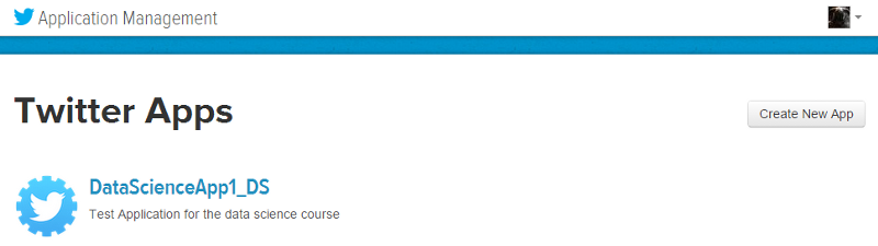
    To get data from twitter, first we need to create a new Twitter application to get OAuth credentials and access to their APIs. For doing this, head over to the Twitter Application Management page and sign in with your Twitter credentials. Once you are logged in, click on the Create New App button as you can see in the snapshot below. Once you create the application, you will be able to view it in your dashboard just like the application I created, named DataScienceApp1_DS shows up in my dashboard depicted below.

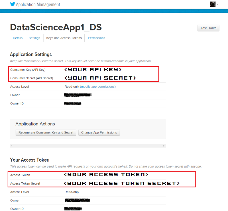
    On clicking the application, it will take you to your application management dashboard. Here, you will find the necessary keys you need in the Keys and Access Tokens section. The main tokens you need are highlighted in the snapshot below.

    I will be doing most of my analysis using the Python programming language. To be more specific, I will be using the IPython shell, but you are most welcome to use the language of your choice, provided you get the relevant API wrappers and necessary libraries.

    Installing necessary packages

    After obtaining the necessary tokens, we will be installing some necessary libraries and packages, namely twitter, prettytable and matplotlib. Fire up your terminal or command prompt and use the following commands to install the libraries if you don’t have them already.

    Creating a Twitter API Connection

    Once the packages are installed, you can start writing some code. For this, open up the IDE or text editor of your choice and use the following code segment to create an authenticated connection to Twitter’s API. The way the following code snippet works, is by using your OAuth credentials to create an object called auth that represents your OAuth authorization. This is then passed to a class called Twitter belonging to the twitter library and we create a resource object named twitter_api that is capable of issuing queries to Twitter’s API.

    If you do a print twitter_api and all your tokens are corrent, you should be getting something similar to the snapshot below. This indicates that we’ve successfully used OAuth credentials to gain authorization to query Twitter’s API.

    Exploring Trending Topics

    Now that we have a working Twitter resource object, we can start issuing requests to Twitter. Here, we will be looking at the topics which are currently trending worldwide using some specific API calls. The API can also be parameterized to constrain the topics to more specific locales and regions. Each query uses a unique identifier which follows the Yahoo! GeoPlanet’s Where On Earth (WOE) ID system, which is an API itself that aims to provide a way to map a unique identifier to any named place on Earth. The following code segment retrieves trending topics in the world, the US and in India.

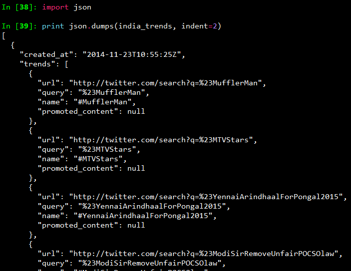
    Once you print the responses, you will see a bunch of outputs which look like JSON data. To view the output in a pretty format, use the following commands and you will get the output as a pretty printed JSON shown in the snapshot below.

    To view all the trending topics in a convenient way, we will be using list comprehensions to slice the data we need and print it using prettytable as shown below.

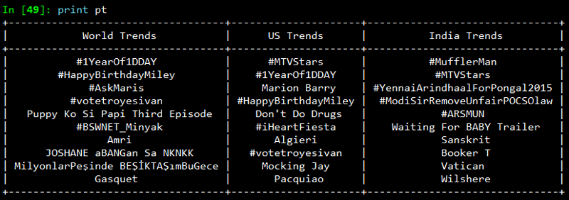
    On printing the result, you will get a neatly tabulated list of current trends which keep changing with time.

    Now, we will try to analyze and see if some of these trends are common. For that we use Python’s set data structure and compute intersections to get common trends as shown in the snapshot below.

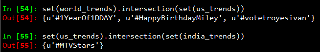
    Interestingly, some of the trending topics at this moment in the US are common with some of the trending topics in the world. The same holds good for US and India.

    Mining for Tweets

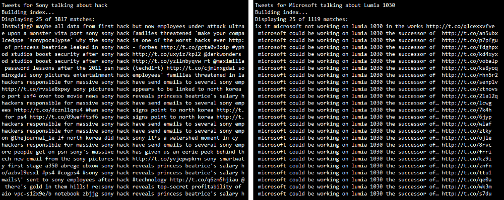
    In this section, we will be looking at ways to mine Twitter for retrieving tweets based on specific queries and extracting useful information from the query results. For this we will be using Twitter API’s GET search/tweets resource. Since the Google Nexus 6 phone was launched recently, I will be using that as my query string. You can use the following code segment to make a robust API request to Twitter to get a size-able number of tweets.

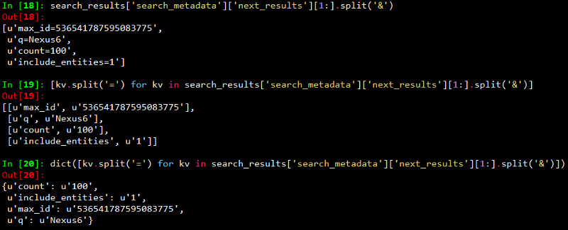
    The code snippet above, makes repeated requests to the Twitter Search API. Search results contain a special search_metadata node that embeds a next_results field with a query string that provides the basis of making a subsequent query. If we weren’t using a library like twitter to make the HTTP requests for us, this preconstructed query string would just be appended to the Search API URL, and we’d update it with additional parameters for handling OAuth. However, since we are not making our HTTP requests directly, we must parse the query string into its constituent key/value pairs and provide them as keyword arguments to the search/tweets API endpoint. I have provided a snapshot below, showing how this dictionary of key/value pairs are constructed which are passed as kwargs to the Twitter.search.tweets(..) method.

    Analyzing the structure of a Tweet

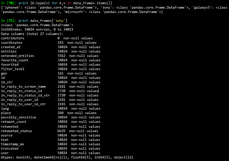
    In this section we will see what are the main features of a tweet and what insights can be obtained from them. For this we will be taking a sample tweet from our list of tweets and examining it closely. To get a detailed overview of tweets, you can refer to this excellent resource created by Twitter. I have extracted a sample tweet into the variable sample_tweet for ease of use. sample_tweet.keys() returns the top-level fields for the tweet.

    Typically, a tweet has some of the following data points which are of great interest.

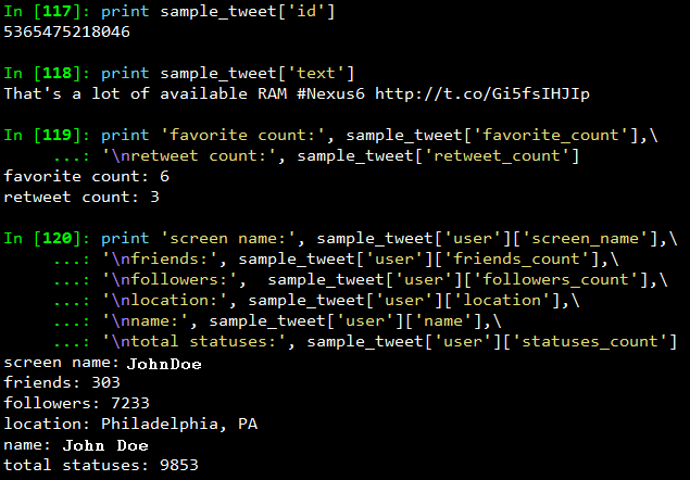
    The identifier of the tweet can be accessed through sample_tweet[‘id’]

    • The human-readable text of a tweet is available through sample_tweet[‘text’]
    • The entities in the text of a tweet are conveniently processed and available through sample_tweet[‘entities’]
    • The “interestingness” of a tweet is available through sample_tweet[‘favorite_count’] and sample_tweet[‘retweet_count’], which return the number of times it’s been bookmarked or retweeted, respectively
    • An important thing to note, is that, the retweet_count reflects the total number of times the original tweet has been retweeted and should reflect the same value in both the original tweet and all subsequent retweets. In other words, retweets aren’t retweeted
    • The user details can be accessed through sample_tweet[‘user’] which contains details like screen_name, friends_count, followers_count, name, location and so on

    Some of the above datapoints are depicted in the snapshot below for the sample_tweet. Note, that the names have been changed to protect the identity of the entity that created the status.

    Before we move on to the next section, my advice is that you should play around with the sample tweet and consult the documentation to clarify all your doubts. A good working knowledge of a tweet’s anatomy is critical to effectively mining Twitter data.

    Extracting Tweet Entities

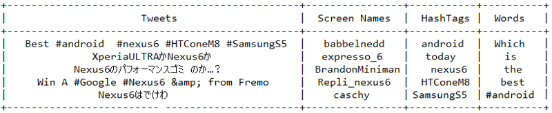
    In this section, we will be filtering out the text statuses of tweets and different entities of tweets like hashtags. For this, we will be using list comprehensions which are faster than normal looping constructs and yield substantial perfomance gains. Use the following code snippet to extract the texts, screen names and hashtags from the tweets. I have also displayed the first five samples from each list just for clarity.

    Once you print the table, you should be getting a table of the sample data which should look something like the table below but with different content ofcourse!

    Frequency Analysis of Tweet and Tweet Entities

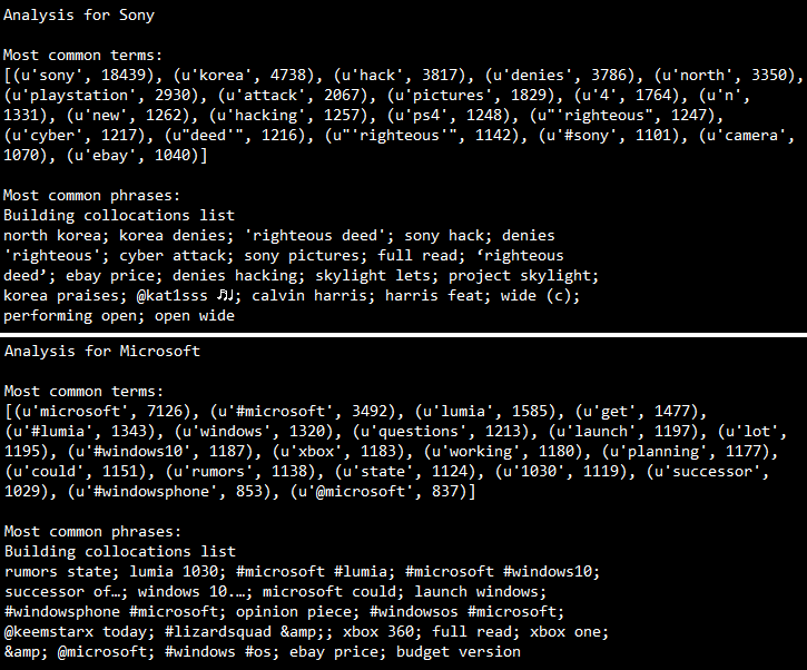
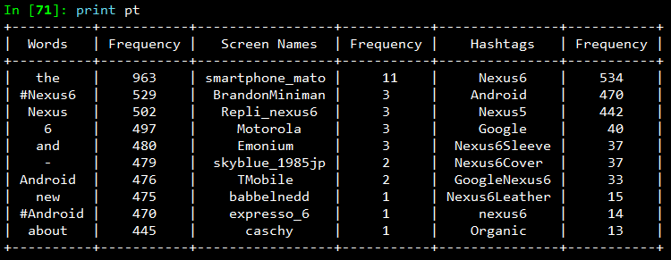
    Once we have all the required data in relevant data structures, we will do some analysis on it. The most common analysis would be a frequency analysis where we find out the most common terms occurring in different entities of the tweets. For this we will be making use of the collection module. The following code snippet ranks the top ten most occurring tweet entities and prints them as a table.

    The output I obtained is shown in the snapshot below. As you can see, there is a lot of noise in the tweets because of which several meaningless terms and symbols have crept into the top ten list. For this, we can use some pre-processing and data cleaning techniques.

    Analyzing the Lexical Diversity of Tweets

    A slightly more advanced measurement that involves calculating simple frequencies and can be applied to unstructured text is a metric called lexical diversity. Mathematically, lexical diversity can be defined as an expression of the number of unique tokens in the text divided by the total number of tokens in the text. Let us take an example to understand this better. Suppose you are listening to someone who repeatedly says “and stuff” to broadly generalize information as opposed to providing specific examples to reinforce points with more detail or clarity. Now, contrast that speaker to someone else who seldom uses the word “stuff” to generalize and instead reinforces points with concrete examples. The speaker who repeatedly says “and stuff” would have a lower lexical diversity than the speaker who uses a more diverse vocabulary.

    The following code snippet, computes the lexical diversity for status texts, screen names, and hashtags for our data set. We also measure the average number of words per tweet.

    The output which I obtained is depicted in the snapshot below.

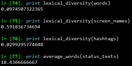
    Now, I am sure you must be thinking, what on earth do the above numbers indicate? We can analyze the above results as follows.

    • The lexical diversity of the words in the text of the tweets is around 0.097. This can be interpreted as, each status update carries around 9.7% unique information. The reason for this is because, most of the tweets would contain terms like Android, Nexus 6, Google
    • The lexical diversity of the screen names, however, is even higher, with a value of 0.59 or 59%, which means that about 29 out of 49 screen names mentioned are unique. This is obviously higher because in the data set, different people will be posting about Nexus 6
    • The lexical diversity of the hashtags is extremely low at a value of around 0.029 or 2.9%, implying that very few values other than the #Nexus6hashtag appear multiple times in the results. This is relevant because tweets about Nexus 6 should contain this hashtag
    • The average number of words per tweet is around 18 words

    This gives us some interesting insights like people mostly talk about Nexus 6 when queried for that search keyword. Also, if we look at the top hashtags, we see that Nexus 5 co-occurs a lot with Nexus 6. This might be an indication that people are comparing these phones when they are tweeting.

    Examining Patterns in Retweets

    In this section, we will analyze our data to determine if there were any particular tweets that were highly retweeted. The approach we’ll take to find the most popular retweets, is to simply iterate over each status update and store out the retweet count, the originator of the retweet, and status text of the retweet, if the status update is a retweet. We will be using a list comprehension and sort by the retweet count to display the top few results in the following code snippet.

    The output I obtained is depicted in the following snapshot.

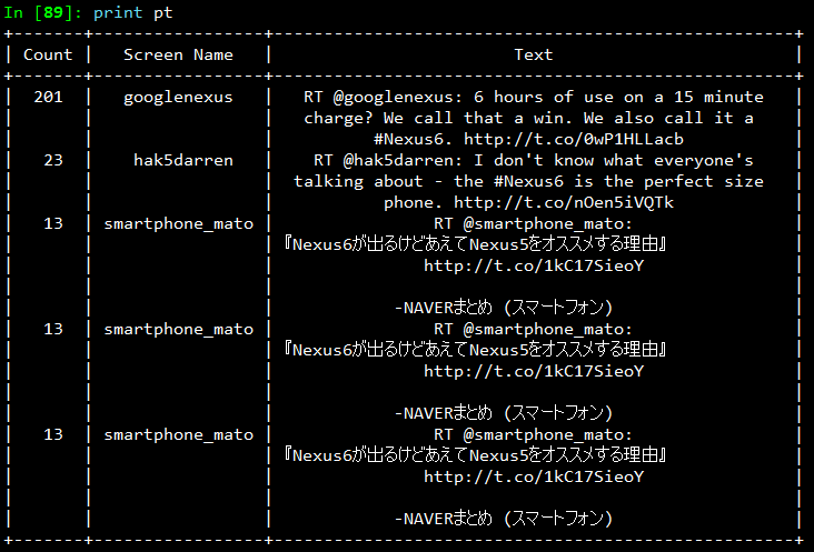
    From the results, we see that the top most retweet is from the official googlenexus channel on Twitter and the tweet speaks about the phone being used non-stop for 6 hours on only a 15 minute charge. Thus, you can see that this has definitely been received positively by the users based on its retweet count. You can detect similar interesting patterns in retweets based on the topics of your choice.

    Visualizing Frequency Data

    In this section, we will be creating some interesting visualizations from our data set. For plotting we will be using matplotlib, a popular Python plotting library which comes inbuilt with IPython. If you don’t have matplotlib loaded by default use the command import matplotlib.pyplot as plt in your code.

    Visualizing word frequencies

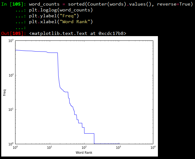
    In our first plot, we will be displayings the results from the words variable which contains different words from the tweet status texts. Using Counter from the collections package, we generate a sorted list of tuples, where each tuple is a (word, frequency) pair. The x-axis value will correspond to the index of the tuple, and the y-axis will correspond to the frequency for the word in that tuple. We transform both axes into a logarithmic scale because of the vast number of data points.

    Visualizing words, screen names, and hashtags

    A line chart of frequency values is decent enough. But what if we want to find out the number of words having a frequency between 1–5, 5–10, 10–15… and so on. For this purpose we will be using a histogram to depict the frequencies. The following code snippet achieves the same.

    What this essentially does is, it takes all the frequencies and groups them together and creates bins or ranges and plots the number of entities which fall in that bin or range. The plots I obtained are shown below.

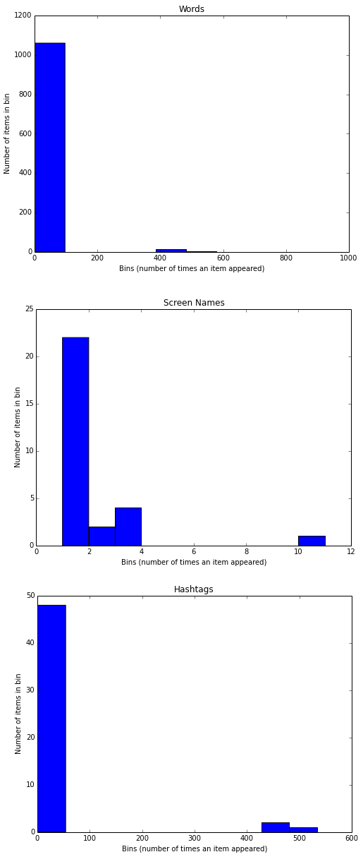
    From the above plots, we can observe that, all the three plots follow the “Pareto Principle” i.e, almost 80% of the words, screen names and hashtags have a frequency of only 20% in the whole data set and only 20% of the words, screen names and hashtags have a frequency of more than 80% in the data set. In short, if we consider hashtags, a lot of hashtags occur maybe only once or twice in the whole data set and very few hashtags like #Nexus6 occur in almost all the tweets in the data set leading to its high frequency value.

    Visualizing retweets

    In this visualization, we will be using a histogram to visualize retweet counts using the following code snippet.

    The plot which I obtained is shown below.

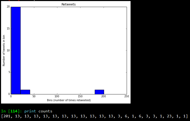
    Looking at the frequency counts, it is clear that very few retweets have a large count.

    I hope you have seen by now, how powerful Twitter APIs are and using simple Python libraries and modules, it is really easy to generate very powerful and interesting insights. That’s all for now folks! I will be talking more about Twitter Mining in another post sometime in the future. A ton of thanks goes out to Matthew A. Russell and his excellent book Mining the Social Web, without which this post would never have been possible. Cover image credit goes to Social Media.