Category: Brand Perception

  • Market Intelligence Platform with Kenshoo

    Market Intelligence Platform with Kenshoo

    We’re thrilled to announce that we have teamed up with Kenshoo to offer an integrated marketing solution that combines DataWeave’s digital shelf analytics and commerce intelligence platform with Kenshoo’s ad automation platform. This in turn, provides better recommendations on promotions to retailers and consumer brands.

    As e-commerce surges, consumer brands can now promote their products through retail-intelligent advertising. Product discoverability, content audit, and availability across large marketplaces can be critical to a brand’s success. Using DataWeave’s digital shelf solutions, Kenshoo now can offer marketers greater visibility into a brand’s performance.

    Even large retailers and agencies can use our commerce intelligence platform to improve their price positioning, address category assortment gaps, and more.  

    Through this partnership, Kenshoo – a global leader in marketing technology, can help its significant base of consumer brands and retailers invest their marketing dollars intelligently and in a timely manner.

    At DataWeave, we have constantly strived to bring in a holistic approach to help our customers optimize their online sales channels. This partnership furthers our resolve in this direction. As we collectively strive to adjust to a post-COVID-19 world, we are observing an acceleration towards digital commerce. This acceleration and change in consumer behavior is going to be a lasting change, creating significant growth opportunities for both DataWeave and Kenshoo.

    With this partnership, we look forward to helping our customers make timely, intelligent, and data-driven decisions to grow their business.

  • Baahubali 2: Dissecting 75,000 Tweets to Uncover Audience Sentiments

    Baahubali 2: Dissecting 75,000 Tweets to Uncover Audience Sentiments

    Why did Katappa kill Baahubali?

    Two years ago, not many would have foreseen this sentence capturing the imagination of the country like it has. Demolishing all regional barriers, the movie has grossed over INR 500 crores across the world in only its first three days.

    While the first movie received lavish praise for its ambition, technical values, and story, the sequel, bogged by bloated expectations, has polarized the critics fraternity. Some critics compare the movie’s computer graphics favorably to Hollywood productions like Lord of the Rings. Others find the movie lacking in pacing and plot.

    The masses, however, have reportedly lapped the movie up. Social media channels are brimming with opinions, and if one is to attempt finding out the aggregate views of audiences, Twitter is a good place to start.

    At DataWeave, we ran our proprietary, AI-powered ‘Sentiment Analysis’ algorithm over all tweets about Baahubali 2 the first three days of its release, and observed some interesting insights.

    Twitterati Reactions to Baahubali 2

    Overall, the Twitterati’s views on the movie were overwhelmingly positive. We analysed over 75,000 tweets and identified the sentiments expressed on several facets of the movie, such as, Visuals, Acting, Prabhas, etc. The following graphic indicates how the movie fared in some of these categories.

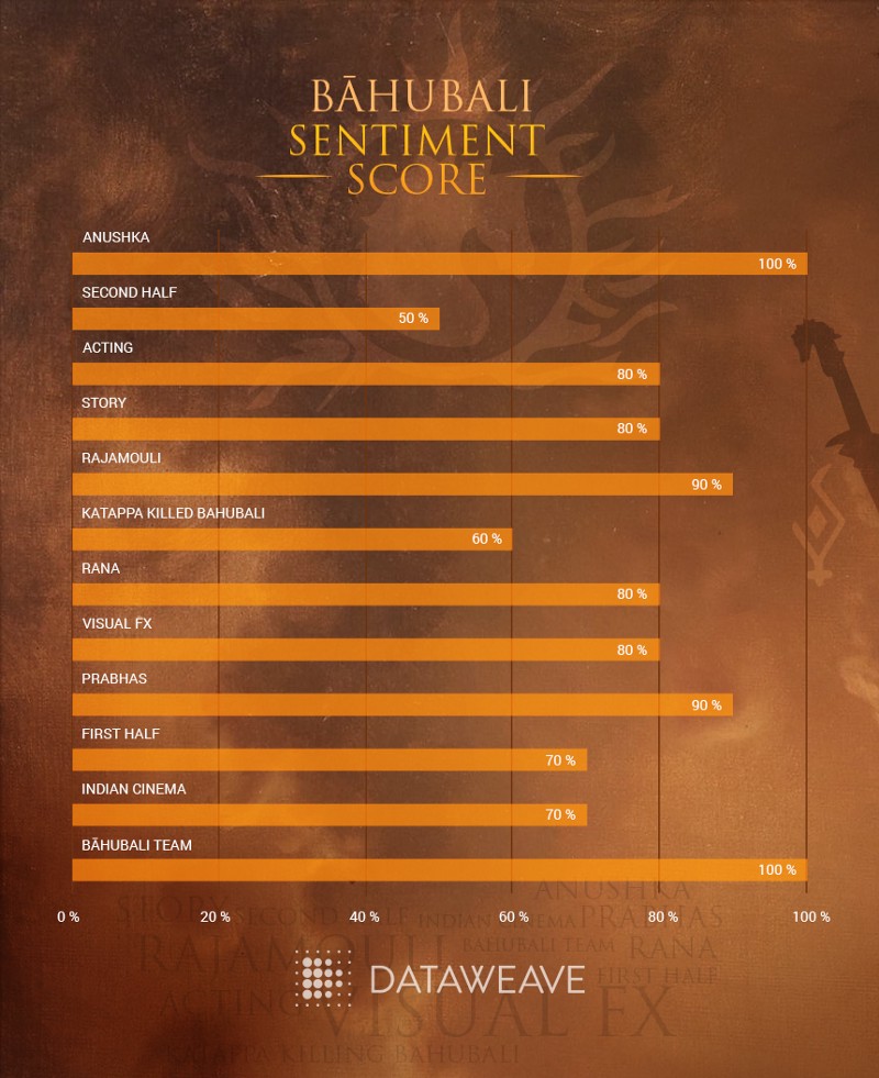
    The Baahubali team, Anushka (actor), Rajamouli (director), and Prabhas (actor), are all perceived as huge positive influences on the movie. Rajamouli, specifically, met with almost universal approval for his dedication and execution. Several viewers cheered the movie on as a triumph of Indian cinema, one which has redefined the cinema landscape of the country. There was considerable praise for the story, Rana (actor), and acting performances, as well.

    The not-so-positive sentiments were reserved for the reason behind Katappa killing Baahubali (no spoilers!), the visuals, and the second half of the movie. Many viewers found the second half to be slow, with unrealistic visuals and action sequences. For example, one of the tweets read:

    “First half was good, but the second half is beyond Rajnikanth movies: humans uprooting trees!”

    While these insights seem simple enough to understand, the technology to filter inevitably chaotic online content and extract meaningful information is incredibly complex.

    Unearthing Meaning from Chaos

    At DataWeave, we provide enterprises with Competitive Intelligence as a Service by aggregating and analyzing millions of unstructured data points on the web, across multiple sources. This enables businesses to better understand their competitive environment and make data-driven decisions to grow their business.

    One of our solutions — Sentiment Analysis — helps brands study customer preferences at a product attribute level by analyzing customer reviews. We used the same technology to analyze the reaction of audiences globally to Baahubali 2. After data acquisition, this process consists of three steps –

    Step 1: Features Extraction

    To identify the “features” that reviewers are talking about, we first understand the syntactical structure of the tweets and separate words into nouns, verbs, adjectives, etc. This needs to account for complexities like synonyms, spelling errors, paraphrases, noise, etc. Our AI-based technology platform then uses various advanced techniques to generate a list of “uni-features” and “compound features” (more than one word for a feature).

    Step 2: Identifying Feature-Opinion Pairs

    Next, we identify the relationship between the feature and the opinion. One of the reasons this is challenging with twitter is, most of the time, twitter users treat grammar with utter disdain. Case in point:

    “I saw the movie visuals awesome bad climax felt director unnecessarily dragged the second half”

    In this case, the feature-opinion pairs are visuals: awesome, climax: bad, second half: unnecessarily dragged. Clearly, something as simple as attributing the nearest opinion-word to the feature is not good enough. Here again, we use advanced AI-based techniques to accurately classify feature-opinion pairs.

    We classified close to 1000 opinion words and matched them to each feature. The infographic below shows groups of similar words that the AI algorithm clustered into a single feature, and the top positive and negative sentiments expressed by the Twitterati for each feature.

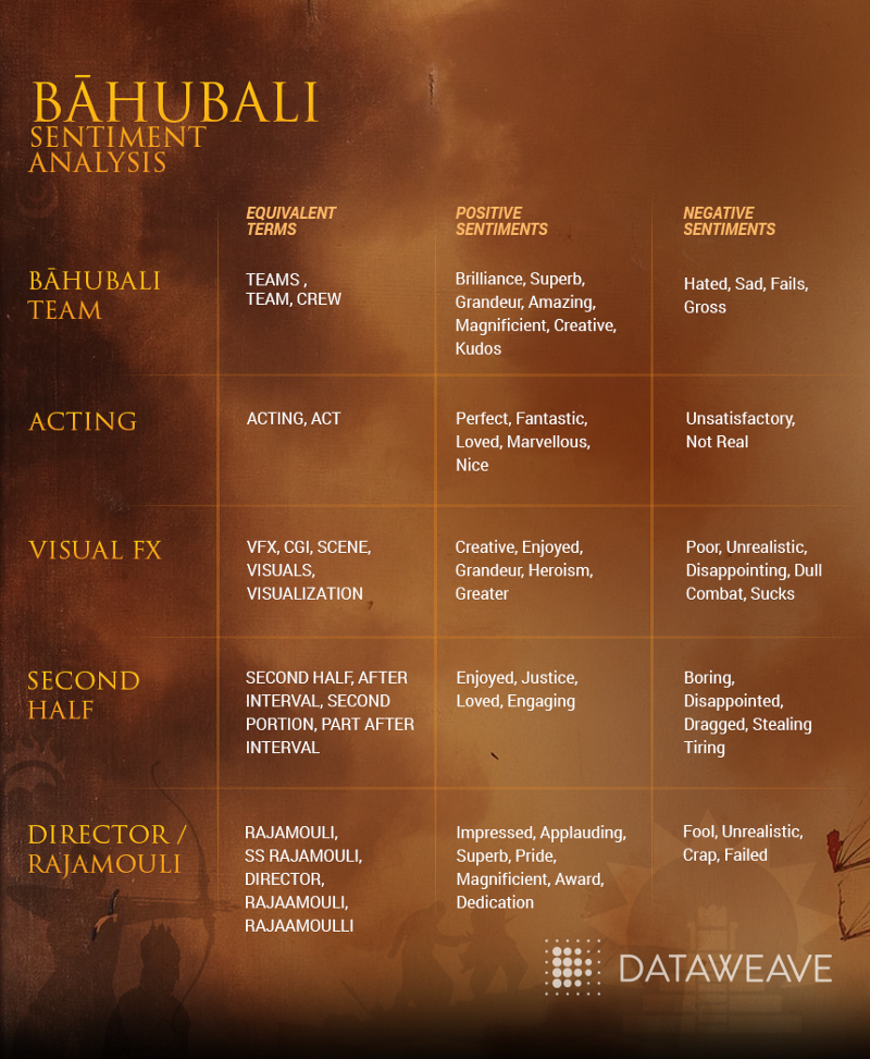
    While our technology can associate words with similar meaning, such as, ‘part after interval’ and ‘second half’, it can also identify spelling errors by identifying and grouping ‘Rajamouli’ and ‘Raajamouli’ as a single feature.

    Adjectives like ‘magnificent’ and ‘creative’ were used to describe the Baahubali team positively, while words like ‘boring’, ‘disappointed’, and ‘tiring’ were used to describe the second half of the movie negatively.

    Step 3: Sentiment Calculation

    Lastly, we calculate the sentiment score, which is determined by the strength of the opinion-word, number of retweets and the time of tweet. A weighted average is normalized and we generate a score on a scale of 0% to 100%.

    A Peephole into the Consumer’s Mind

    As more and more people express their views and opinions in the online world, there is more of an opportunity to use these data points to drive business strategies.

    Consumer-focused brands use DataWeave’s Sentiment Analysis solution as a key element of their product strategy, by reinforcing attributes with positive sentiments in reviews, and improving or eliminating attributes with negative sentiments in reviews.

    Click here to find out more about the benefits of using DataWeave’s Sentiment Analysis!


  • Dissonance in Online MRP Prices Across Retailers | DataWeave

    Dissonance in Online MRP Prices Across Retailers | DataWeave

    We all know, online shopping offers a lot of benefits to shoppers. Apart from the convenience it offers access to a wide-assortment base and, of course, discounts are an added benefit. Often we see, retailers claiming large discounts on products.

    Many-a-time, the percentage discount that is mentioned drives price perception. Customers when comparing prices across stores view larger percentage discounts as a better deal. However, this is not necessarily the case. To present this case, let us look into how discounts are calculated:

    Percentage discounts are a function of the MRP / MSRP and the Selling Price. The MRP / MSRP is set by the manufacturer and the selling price is more often than not determined by the retailer.

    Selling price of products being different across retailers is a well-known fact. When the MRP of the same products tend to vary across retailers, it gets confusing for a customer, which in turn leads to a brand equity dilution of the brand or manufacturer.

    To analyse how deep this discord is, we decided to dive deeper into its working dynamics. Amongst all the data that we aggregate at DataWeave, analysing discounts of the same product across retailers gives us the ability to discern pricing strategies of retailers. We used this dataset to monitor and analyse MRPs.

    What we found

    1. We analysed MRPs of around 400 brands across 10 categories. Around 44% of products in these brands have no variance in MRPs across retailers

    2. This also means there is a variance in 56% of products

    3. Products in the ‘Mobile Phones and Tablets’ category have the most price variance; 65% of the products have price variance

    4. Fashion and Fashion accessories have the least price variance; around 20%

    5. Brands having the most variance:

    6. Brands having the least variance:

    What are the implications of the above insights?

    1. Brands & manufacturers need to be aware of how their brand products are being represented and sold online
    2. Consumers shopping online need to look at end prices, and not focus on the discount percentage, before making a purchase-decision on a particular store

    This article was previously published on Yourstory

    DataWeaves Brand Intelligence provides consumer brands with the ability to track their products, pricing, discoverability vis-a-vis their competitors across e-commerce platforms.

  • How to Build a Twitter Sentiment Analysis App Using R

    How to Build a Twitter Sentiment Analysis App Using R

    Twitter, as we know, is a highly popular social networking and micro-blogging service used by millions worldwide. Each status or tweet as we call it is a 140 character text message. Registered users can read and post tweets, but unregistered users can only view them. Text mining and sentiment analysis are some of the hottest topics in the analytics domain these days. Analysts are always looking to crunch thousands of tweets to gain insights on different topics, be it popular sporting events such as the FIFA World Cup or to know when the next product is going to be launched by Apple.

    Today, we are going to see how we can build a web app for doing sentiment analysis of tweets using R, the most popular statistical language. For building the front end, we are going to be using the ‘Shiny’ package to make our life easier and we will be running R code in the backend for getting tweets from twitter and analyzing their sentiment.

    The first step would be to establish an authorized connection with Twitter for getting tweets based on different search parameters. For doing that, you can follow the steps mentioned in this document which includes the R code necessary to achieve that.

    After obtaining a connection, the next step would be to use the ‘shiny’ package to develop our app. This is a web framework for R, developed by RStudio. Each app contains a server file ( server.R ) for the backend computation and a user interface file ( ui.R ) for the frontend user interface. You can get the code for the app from my github repository here which is fairly well documented but I will explain the main features anyway.

    The first step would be to develop the UI of the application, you can take a look at the ui.R file, we have a left sidebar, where we take input from the user in two text fields for either twitter hashtags or handles for comparing the sentiment. We also create a slider for selecting the number of tweets we want to retrieve from twitter. The right panel consists of four tabs, here we display the sentiment plots, word clouds and raw tweets for both the entities in respective tabs as shown below.

    Coming to the backend, remember to also copy the two dictionary files, ‘negative_words.txt’ and ‘positive_words.txt’ from the repository because we will be using them for analyzing and scoring terms from tweets. On taking a close look at the server.R file, you can notice the following operations taking place.

    – The ‘TweetFrame’ function sends the request query to Twitter, retrieves the tweets and aggregates it into a data frame. — The ‘CleanTweets’ function runs a series of regexes to clean tweets and extract proper words from them. — The ‘numoftweets’ function calculates the number of tweets. — The ‘wordcloudentity’ function creates the word clouds from the tweets. — The ‘sentimentalanalysis’ and ‘score.sentiment’ functions performs the sentiment analysis for the tweets.

    These functions are called in reactive code segments to enable the app to react instantly to change in user input. The functions are documented extensively but I’ll explain the underlying concept for sentiment analysis and word clouds which are generated.

    For word clouds, we get the text from all the tweets, remove punctuation and stop words and then form a term document frequency matrix and sort it in decreasing order to get the terms which occur the most frequently in all the tweets and then form a word cloud figure based on those tweets. An example obtained from the app is shown below for hashtags ‘#thrilled’ and ‘#frustrated’.

    For sentiment analysis, we use Jeffrey Breen’s sentiment analysis algorithm cited here, where we clean the tweets, split tweets into terms and compare them with our positive and negative dictionaries and determine the overall score of the tweet from the different terms. A positive score denoted positive sentiment, a score of 0 denotes neutral sentiment and a negative score denotes negative sentiment. A more extensive and advanced n-gram analysis can also be done but that story is for another day. An example obtained from the app is shown below for hashtags ‘#thrilled’ and ‘#frustrated’.

    After getting the server and UI code, the next step is to deploy it in the server, we will be using shinyapps.io server which allows you to host your R web apps free of charge. If you already have the code loaded up in RStudio, you can deploy it from there using the ‘deployApp()’ command.

    You can check out a live demo of the app.

    It’s still under development so suggestions are always welcome.

  • How to Extract Colors From an Image

    How to Extract Colors From an Image

    We have taken a special interest in colors in recent times. Some of us can even identify and name a couple of dozen different colors! The genesis for this project was PriceWeave’s Color Analytics offering. With Color Analytics, we provide detailed analysis in colors and other attributes related to retailers and brands in Apparel and Lifestyle products space.

    The Idea

    The initial idea was to simply extract the dominating colors from an image and generate a color palette. Fashion blogs and Pinterest pages are updated regularly by popular fashion brands and often feature their latest offerings for the current season and their newly released products. So, we thought if we can crawl these blogs periodically after every few days/weeks, we can plot the trends in graphs using the extracted colors. This timeline is very helpful for any online/offline merchant to visualize the current trend in the market and plan out their own product offerings.

    We expanded this to include Apparel and Lifestyle products from eCommerce websites like Jabong, Myntra, Flipkart, and Yebhi, and stores of popular brands like Nike, Puma, and Reebok. We also used their Pinterest pages.

    Color Extraction

    The core of this work was to build a robust color extraction algorithm. We developed a couple of algorithms by extending some well known techniques. One approach we followed was to use standard unsupervised machine learning techniques. We ran k-means clustering against our images data. Here k refers to the number of colors we are trying to extract from the image.

    In another algorithm, we extracted all the possible color points from the image and used heuristics to come up with a final set of colors as a palette.

    Another of our algorithms was built on top of the Python Image Library (PIL) and the Colorific package to extract and produce the color palette from the image.

    Regardless of the approach we used, we soon found out that both speed and accuracy were a problem. Our k-means implementation produced decent results but it took 3–4 seconds to process an entire image! This might not seem much for a small set of images, but the script took 2 days to process 40,000 products from Myntra.

    Post this, we did a lot of tweaking in our algorithms and came up with a faster and more accurate model which we are using currently.

    ColorWeave API

    We have open sourced an early version of our implementation. It is available of github here. You can also download the Python package from the Python Package Index here. Find below examples to understand its usage.

    Retrieve dominant colors from an image URL

    from colorweave import palette print palette(url="image_url")
    
    Retrive n dominant colors from a local image and print as json:


    print palette(url="image_url", n=6, output="json")
    
    Print a dictionary with each dominant color mapped to its CSS3 color name


    print palette(url="image_url", n=6, format="css3")
    
    Print the list of dominant colors using k-means clustering algorithm


    print palette(url="image_url", n=6, mode="kmeans")

    Data Storage

    The next challenge was to come up with an ideal data model to store the data which will also let us query on it. Initially, all the processed data was indexed by Solr and we used its REST API for all our querying. Soon we realized that we have to come up with better data model to store, index and query the data.

    We looked at a few NoSQL databases, especially column oriented stores like Cassandra and HBase and document stores like MongoDB. Since the details of a single product can be represented as a JSON object, and key-value storage can prove to be quite useful in querying, we settled on MongoDB. We imported our entire data (~ 160,000 product details) to MongoDB, where each product represents a single document.

    Color Mapping

    We still had one major problem we needed to resolve. Our color extraction algorithm produces the color palette in hexadecimal format. But in order to build a useful query interface, we had to translate the hexcodes to human readable color names. We had two options. Either we could use a CSS 2.0 web color names consisting on 16 basic colors (White, Silver, Gray, Black, Red, Maroon, Yellow, Olive, Lime, Green, Aqua, Teal, Blue, Navy, Fuchsia, Purple) or we could use CSS 3.0 web color names consisting of 140 colors. We used both to map colors and stored those colors along with each image.

    Color Hierarchy

    We mapped the hexcodes to CSS 3.1 which has every possible shades for the basic colors. Then we assigned a parent basic color for every shades and stored them separately. Also, we created two fields — one for the primary colors and the other one for the extended colors which will help us in indexing and querying. At the end, each product had 24 properties associated with it! MongoDB made it easier to query on the data using the aggregation framework.

    What next?

    A few things. An advanced version of color extraction (with a number of other exciting features) is being integrated into PriceWeave. We are also working on building a small consumer facing product where users will be able to query and find products based on color and other attributes. There are many other possibilities some of which we will discuss when the time is ripe. Signing off for now!


    Originally published at blog.dataweave.in.